


By Dr. Alan Johnston / 12.18.2013
Professor of Archaeology
University College London
Background
It is my intention is to consider the extent to which writing surfaces, rather than other considerations, may be seen to have influenced the appearance of text in the early centuries of alphabetic writing in the Mediterranean world, with special emphasis on Greek-speaking and -writing areas, thus addressing the question of materiality that is the focus of this volume. My title may suggest a teleological approach — we use, or should I say used to use, joined-up writing, and therefore how did people in the 7th to 4th centuries bc square up to this inevitability? But the very fact that I feel obliged to say “used to use” demonstrates a procedural weakness of that approach. Yet it is patently obvious that by the time of the destruction of Pompeii there was widespread popular use of ‘literary’, hasty writing, and it is of interest to see in what ways this development was generated, and especially where its roots lie.
Here there arises a basic modern division between scholars, which revolves around the use of the word ‘cursive’; it is as good a starting point as any. Papyrologists and palaeographers reserve the word for a complete system of writing in which the straight line is largely replaced by the flowing curve; epigraphists on the other hand are happy to use the word for individual letter forms — ‘this inscription has cursive tendencies’, be it the nearly, but never completely, joined-up, ‘scrawl’ of imperial Latin, or the occasional letter form which adopts a rounded not angular shape. The variation of use of the term is easy enough to comprehend and take into proper account, but should be kept in mind (for a thorough review of the mechanics and effect of such writing in the Roman period, see Parkes 2008).

Figure 1: Ligatures among underfoot graffiti on Attic vases (after Johnston 1980: fig. 3).

Figure 2: Ligature within a word, stone tomb-marker on Thera, 7th century bc (after Hiller von Gaertringen 1898: no. 781).
‘Joined-up’ writing in fact need not bother us much. I merely note that the only form of truly joined writing which appears in the period concerned is the ligature, which is a constant enough feature of very largely non-cursive, in whatever sense, writing from around 550 bc onwards (see Figure 1, on Attic vase bases). It starts, and in most cases continues, as a personal, occasionally corporate, identificatory symbol, a continuation of one of the most prominent early uses of the alphabet, and before that of non-alphabetic signs, to mark personal property. Some regional preferences are apparent here, especially on the island of Thera (Figure 2), where two letters within words can be so linked (Inglese 2008: 56–57); we will have cause to consider regionality of writing practices consistently, a factor to be set beside any more generalised aspects of writing technique.
Papyrus and its Echoes in the Classical Period
These are not well-trodden paths — and when we push through the undergrowth we will see why. I begin with a text from near the end of the period under consideration, an unique post-firing graffito cut on the floor of an Athenian black-painted shallow bowl of c.350 bc from the Kerameikos excavations, though without a precise find location (Figure 3). It is perhaps the longest such graffito text known, apart from a set of modern forgeries, interesting in themselves (Corbett and Woodhead 1955), and certainly unique in other respects. I abbreviate the arguments I proposed (Johnston 1985: especially 297) that this is a record of some kind of reckoning of a month’s work by a group of slaves or metics during a year, the name of whose archon is unfortunately only partly preserved in the first line. I refuse to believe this is a one-off, yet it has no substantial parallel in the very considerable corpus of Athenian inscriptions on stone of the period; therefore it is probably an occasional notation of what otherwise would have been committed in ink to an organic surface, whether wood or papyrus. Yet there is minimal reflection of the use of the brush or pen — i.e. the cursive letter — here, just one apparent simplified sigma. It would be useful to set beside it the only papyrus record which I know from Athens of roughly contemporary date (probably a generation or two earlier). Regrettably however it is a blank; what was soon after its discovery described to me (Nikolaos Yalouris pers. comm.) as a “pudding” does not seem to have survived in any legible way. Some tiny uninscribed scraps are on display in the Peiraeus Archaeological Museum; yet I have the word of the workman who excavated the tomb that the lettering that was visible on the document look like “this” (pointing to the smaller texts on the back of a common or garden cigarette packet), i.e. what in modern Greek or Roman script we call small capitals.[1]
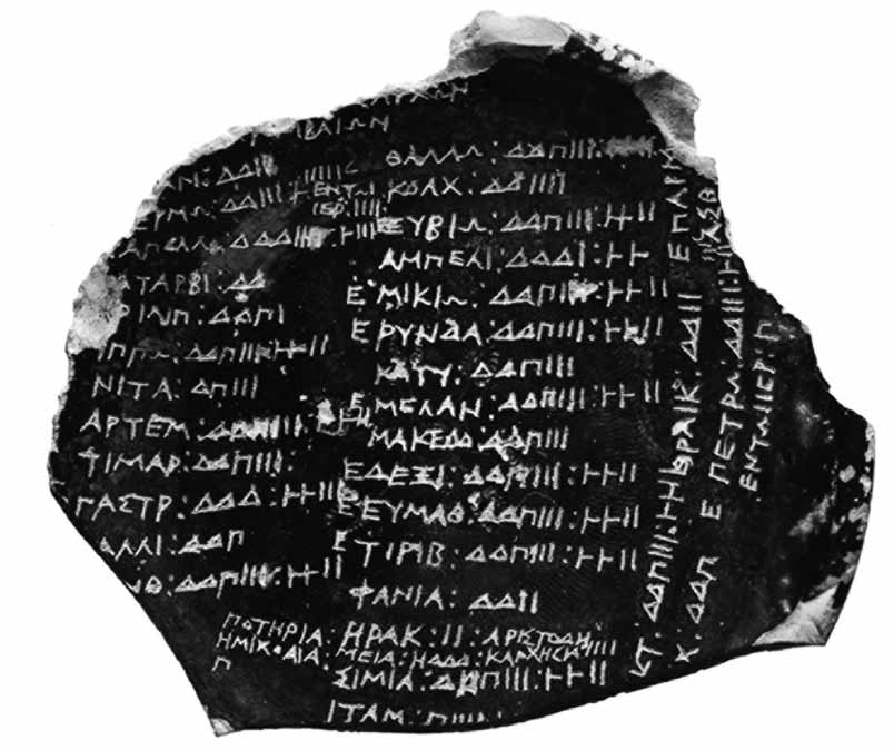
Figure 3: Graffito under the foot of a plate, from the Kerameikos, Athens (Johnston 1985: pl. 58). Kerameikos Museum 2242.
This is not the only evidence one can bring to bear, but it is direct evidence of what we can glean from other secondary sources to be the norm for the written texts of all the great classical authors’ ‘first folios’. I mention here in particular the book-rolls appearing in scenes painted on 5th-century red-figure vases (Figure 4), sometimes with legible texts (Avronidaki 2008: 17–18; Immerwahr 1990: 99), and then the description of lettering given in a play by Euripides, as preserved in a quotation in Athenaeus’ Deipnosophistae (book x, 454b–d): a sigma is likened to the composite Scythian bow. Athenaeus goes on to cite a passage from the later poet Aischrion, perhaps of c.350– 325, where the words used to describe the same letter sigma change from the angled composite bow to the plain arc (Bergk 1878–1882: ii 516, fragment 1; Lloyd-Jones and Parsons 1983, under the heading “Aischrion”).
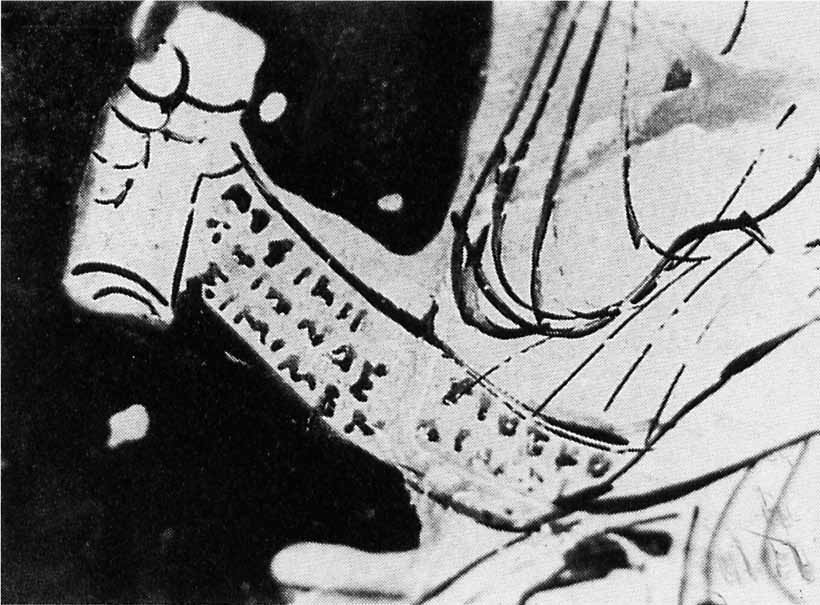
Figure 4: Boeotian red-figured vase with depiction of book-roll (Avronidaki 2008: pl. 7, 4). Whereabouts unknown.
This is precisely the general change that we see in our earliest preserved papyrus text, but it appears a little later, since in the earliest such texts, datable to around 350–325 bc the crooked ‘Scythian bow’ is written (e.g. Johnston 1997: 108, fig. 18, published more fully by Turner 1975; Figure 5)2, and only towards the end of the century does the simple rounded arc begin to predominate, together with other slight signs of literary cursivity — that is to say, in Greek texts. The nearest, perhaps only, parallel in the non- Greek world is the Zagreb mummy (Figure 6) with its extensive Etruscan text (most recently van der Meer 2007). While the date is disputed, probably of the mid-Hellenistic period, we see here little sign of the trends towards cursive writing visible in the Greek record.
Earlier Forays

Figure 5: Papyrus from Saqqara, Egypt, excavation no. Sak 71/2 GP9, no. 5676 (after Johnston 1997: fig. 18). Photograph courtesy of the Egypt Exploration Society.
Here we have an awkward chronological clash regarding the subject of cursivity between the literary references and preserved texts, involving the period c.350 to 300 bc. There are though some even earlier, if sporadic, stirrings. One learns a lot from writers who have made, or think they have made ‘errors’ — and this is not the place to enter on the thorny question of defining orthography; there is room for a doctoral thesis on the topic if only any classical archaeologist-cum-epigrapher would take on such a banal task. First, I repeat a point I have made regarding a much earlier text (Johnston and Jones 1978: 104–105), on an Athenian or Attic amphora of 625–600 bc on display in the British Museum (Figure 7) — where the cutter of an owner’s graffito started incising, correctly, an omicron, but finished it off as a sigma, which should in fact have been the following letter; he confused himself, but only because he could mistake a rounded arc as the top of a sigma. One could have wished for some such happenstance in the earliest long text from the Mediterranean Iron Age, the much discussed ceramic ‘Nestor’s cup’ from Pithekoussai of c.720 bc (Jeffery 1990: pl. 47, 1; Figure 8); but it does not quite happen — an omicron in the first line is corrected to an epsilon in a somewhat ugly manner, and in the second line an omitted nu is rather more deftly inserted just below its proper place and an epsilon was half cut before the inscriber realised the letter should be alpha; but at least it all demonstrates a concern for what was perceived as accuracy.
Figure 6: Detail of Etruscan mummy binding with part of the painted text (van der Meer 2007:201). Zagreb Museum.

Figure 7: Graffiti on shoulder of Attic oil jar, from Vulci (Johnston and Jones 1978: fig. 1). British Museum GR 1848.0619.9.

Figure 8: Drawing of graffito text on ‘Nestor’s cup’ (Jeffery 1990: pl. 47, 1). Lacco Ameno Museum, Ischia.
Here we are getting back to near the origins of Greek alphabetic writing; for whatever reason and at whatever precise period around 900–800 bc, some Greek-speakers geometricised the Semitic alphabet, fitting the somewhat casual angles of the Semitic signs to the visual humanmade representations on artefacts prevailing in the contemporary Greek world — patterns involving straight lines, regularly at 90o or 45o, and circles — the Geometric style. Where that particular style was weakest, on Crete, where far more luxuriant and inventive pictorial designs were common enough, we find the weakest such adaptations of the Semitic letter forms. For example, Crete is one of the areas that retains some of the complexity of the Semitic yod in its iota — unlike the majority of the rest who boldly adopt a simple vertical stroke. Such a curly iota is found in a 7th-century graffito on a pot from Knossos (Johnston 1996), for example. In contrast, on the island of Thera, which is clearly dependent on Crete for its alphabet, the iota appears not only in painted texts — most strikingly a ‘doll’s-house’ (Jeffery 1990: 470, A and pl. 79) and the unpublished example of the deceased’s name painted on the foot of a similar Athenian oil amphora used as a grave marker, both c.600 bc. It is also important to note examples occuring in rock-cut graffiti. Occasionally on these we find the same letters made of either curving or straight strokes, or indeed single letters employing both, in the same text (e.g. Inglese 2008: 469, 473; Figure 9).
a)  b)
b) 
c) 
Figure 9: a) Graffito on jug, from Knossos (Johnston 1996: fig. 107, 84); b) House model, door jambs, with painted texts (Jeffery 1990: pl. 79, 4–5). Thera Museum; c) Rock-cut text, from Thera (Jeffery 1990: pl. 91, 1a).
This form of mixed usage continues. Curving lines are cut on stone, and on pots, straight lines are used in painted texts, with little particular pattern of usage that I can observe. The overall framework, however, always remains the geometricised set of signs of the period of origin, as noted at the beginning of the previous paragraph.
Surfaces

Figure 10: Marble stele of Phanodikos, from Sigeion (Jeffery 1990: pl. 71, 43–44). British Museum GR 1816.0610.107.
We should also recognise that writing is deployed on a vast range of preserved materials, with no exceptions known to me, except obsidian and amber; even one lead architectural clamp from the Agora excavations has a text, albeit very difficult to read, cut on it (David Jordan pers. comm.). The full extent of painted texts will never be known to us; it would be a nice pipe-dream to think that in, say, 2030, somebody will write “people made the claim only two decades ago that we would never read such texts”. In the British Museum is a remarkable early marble monument, of c.600 bc (Figure 10), where both angular and curvy sigmas are still discernible — Phanodikos’ stele, an epigraphic colossus to place beside contemporary sculptural tours de force up to four times life size (Jeffery 1990: 371, no. 43, pl. 71). It was removed by Elgin from near the site of ancient Sigeion in the Troad. The cutting on it of a similar text in two different Greek dialects and scripts, Attic and Ionic, says much about the independence of the small Greek states of the period and their local pride, but also something about locally-driven writing habits. Ann Jeffery noted that in the area of Ionia there is much scruffy looking writing on stone dated to the 6th century, and she wondered whether this may have been the result of the reported flowering here of many branches of written literature, presumably produced in ink, at this time (Jeffery 1990: 57). It is certainly a tendency far different from that of Athens later, in the 5th century, where we see a new ‘aesthetic’, I use the word deliberately, of formally patterned chessboards of letters. Ironically, however, that stoichedon system may have been initiated in Ionia, an early example being the scruffy lettering, but also patterned, text on the side of the throne dedicated on Samos by Aiakes (Figure 11), a piece, whether sculpture or text, of much disputed date — 540 or 500? bc — (see Immerwahr 1990: 96–97 for an assessment, even if he tends towards an Athenian origin for the system).

Figure 11: Engraved dedication of Aiakes, found on a marble seated figure (Jeffery 1990: pl. 63, 13). Samos Museum.
Figure 12: Lead letter from Olbia, Black Sea (Dana 2007: 75). Whereabouts unknown.
Unfortunately we have little substantial evidence to support Jeffery’s suggestion; while we can now point to an expanding series of personal letters written mostly on lead from the broad Ionian world, which are of high interest in other respects — especially for the fact that financial problems seem to be the sole topic of epistolary intercourse — they add little regarding the written word. The grammar sometimes fails to reach A-level standards but that again is by the way. More useful is the reference in one such text (Figure 12) to documents written on skins (see Avram 2007: 239 for general bibliography; diphtheria are mentioned in the text from Olbia, Dana 2007: 75–76, with n. 16).
A recent suggestion that this part of the world did see wide use of cursive writing in the period under consideration has been put forward by Adiego (1998: especially 57–79; 2007: 230–233), who finds the oddities of letter shapes in Carian texts best explained by positing that the forms we have in inscriptions from the later 7th century onward are petrifications of unattested cursive forms used in the area in an earlier period. Much as one would like to see a rational explanation of the Carian alphabet, on all analogy this one seems highly improbable.
The Reader

Figure 13: ‘Hekatompedon’ inscription, reused marble metope (after Kirchner 1948: fig. 20). Epigraphical Museum of Athens 6794.
Concern for any readership is a further aspect worth considering. It is something that is scarcely apparent in the stoichedon system, which had a broad vogue in the 5th and 4th centuries bc. I note an intriguing exception which suggests that Athenian public documents could be deliberately inscribed in a slightly less severe manner: there is a tendency in financial texts to break the line not after the required x letters, but at the end of a syllable closest to the xth letter. More generally, however, in the course of time lettering tends to get smaller and in official texts administrative jargon more profuse. The stoichedon system also seems to have sounded the death knell of the use of interpuncts in formal texts. Greek and Latin texts are notorious for not having word division (not totally true, but a safe general statement).
Interpuncts were used in the Near East and in the Bronze Age Greek syllabic script. They do occur in alphabetic texts, but with no great regularity (Morpurgo-Davies 1987: especially 270– 271, for an overview). Nestor’s cup (Figure 8) in fact is one of the more striking examples where punctuation is used on a generous scale. I have noted that interpuncts, usually two or three dots, appear in roughly one in 50 informal texts of the 6th to 5th centuries at Greek sites where our corpus is large enough to bear such statistical analysis. Its most consistent use is in texts of the archaic period in Athens (Lang 1976; 1990; Threatte 1980: 73–84; and my own counts), though figures vary substantially from one type of text to another: perhaps one in 15 for painted texts on pots, one in 60 for graffiti on pots, including the political ostraka, mostly from the 480s, some one in five for sepulchral stone texts, but two in three for dedicatory texts inscribed in stone. An overall explanation is hard to find, though there may be a hint that interpuncts were fairly widely used in the early period in brush and ink writing on perishable materials. The most striking example is in the highly ornate and early stoichedon text, also of the 480s, known as the Hekatompedon decree (Figure 13), where the difficulties of adapting punctuation to stoichedon are clearly demonstrated — squeezed in or taking up a complete letter space (stoichos). In later Greek stone texts its use is very largely confined to hiving off numerals or limiting abbreviations. Outside the Greek world variety in its usage is apparent. In Etruscan about one in 25 of the 317 early texts in the corpus united by Bagnasco Gianni (1996) have (a variety of) interpuncts, although usage is more considerable in the classical period and after. On the other hand no interpunct appears in the 400 or so mainly late archaic and classical texts from Elymian Segesta (Agostiniani 1977).
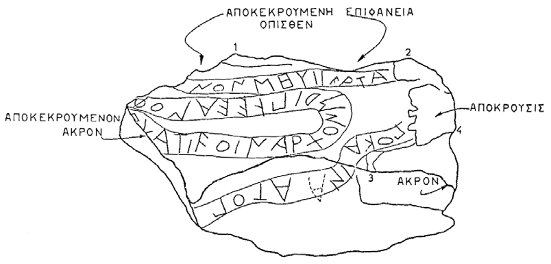
Figure 14: Tiryns cult text, c.600–550 bc (after Verdelis et al. 1975: 159). In situ.
One underlying factor that may explain lack of punctuation may lie in the habit of tracing texts physically letter by letter in the reading process (a word used for reading, ananemo, has the root meaning “to pick up”); the boustrophedon form of writing facilitated this process by not requiring the reader to go back to start a new line. The fact that the two earliest Greek texts preserved which have more than one line, the Nestor cup and its twin from Eretria (Johnston and Andreiomenou 1989), are not written boustrophedon but in lines running right to left may demonstrate a preoccupation with marking the separate lines, a preference not shown in other more or less contemporary verse texts. I also have a need to apologise for wrongly introducing into the literature a further aid to the reader, in the form of guidelines between which the letters were cut, meandering over the stones covering the late Mycenaean underground gallery at Tiryns (Jeffery 1990: 429; Figure 14); the cultic texts are randomly distributed, but the guidelines given in the original drawings in the publication of the material (Verdelis et al. 1975) were the responsibility not of the inscribers, but of the editors, who wished to facilitate the task of the modern reader.
Round the Angles
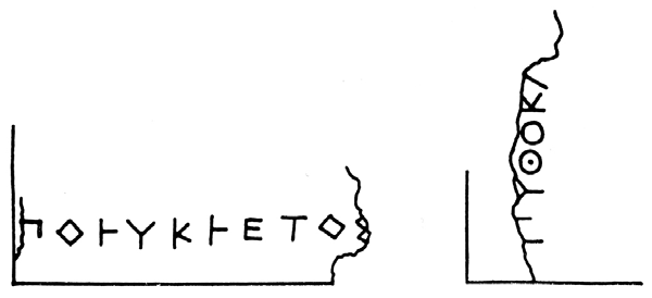
Figure 15: Signature of the sculptor Polykleitos, from Olympia, 450–425 bc (Jeffery 1990: pl. 30, 45). Olympia Museum 675.
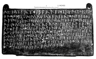
Figure 16: Treaty cut on bronze tablet, from Olympia, c.500 bc (Jeffery 1990: pl. 42, 6). British Museum GR 1824.0499.17.
There are, however, some cases where the nature of the surface surely did lead to particular usages, over and above the matter of rounded pen / brush strokes already tackled above. A number of letters in various Greek and Etruscan scripts have rounded elements; in some they are in a sense secondary, beta and rho (В, Ρ) can have rounded loops, and in some scripts gamma and delta (Γ and Δ) also can have substantial rounded sections. But in all these we find angled alternatives in regular use, and to date I have detected no patterns emerging, either locally or in various media, but would wish to conduct a fuller review. Under the same heading, however, we can note a vogue to the use of squared-off circular parts of letters where more than half a circle is involved — theta, omicron, phi, omega — on bronze and stone, particularly in some areas of the Peloponnese. Polykleitos uses such forms in his signatures on statue bases (Figure 15; but this is probably not the reason why Varro (in Pliny, Natural History, xxxiv 56) describes his statues as “four-square”!). On such hard surfaces the inscribing of circular letters took three main forms, beyond that of doing one’s best with driving a chisel: turning the curve into straight lines, using individual points to make up the curve, or using some form of punch or compass, the latter often leaving a central point (Figure 16).3 Here we can at least make the observation that such usages are at best extremely rare in the painted letters of Greek vase inscriptions; I know of none, but stand to be corrected.
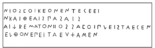
Figure 17: Dedication by Mikythos of Rhegion, on stone base at Olympia, 470–50 bc (Jeffery 1990: pl. 49, 8). Olympia Museum.
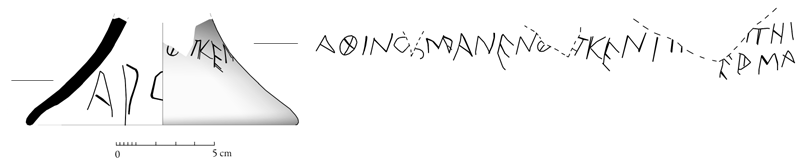
Figure 18: Graffito under foot of Chian cup, from Naukratis, c.600–575 bc. British Museum GR 1888.6-1.421. Drawing by Denitsa Nenova.
Let us turn back to sigma — or the three- or four-stroke sign which does duty for the main sibilant in many Greek poleis or iota in a minority. We have already noted that it can have a curving profile, whatever the medium. I just mention a few more cases, where in fact it is the sibilant that is so shown and is of three strokes. It is quite regularly used in texts inscribed into stone and metal of Rhegion in South Italy (Figure 17), but rarer elsewhere — here a most peculiar case (British Museum GR 1888.6-1.421; Figure 18), an exception that proves the rule if there ever was one — among the 2500 graffiti from Naukratis. What I discussed earlier with respect to later developments in the 4th century bc is of a different character: the so-called lunate sigma, and its cousin the lunate epsilon, quite clearly results from the rapid brush writing of the four-stroke sigma that became the major simple sibilant sign in the Greek alphabet by the late 5th century. We can see some hints of this change in a few painted inscriptions on Attic white-ground lekythoi of the middle of that century, with a minimising of the ‘heart’ of the letter (Immerwahr 1990: 158, S14; Figure 19). Here it is of relevance to note that there is no clear, immediate successor to that set, and just one possible predecessor, a truly unusual text: among the cache of baked clay tablets found in the ruins of Persepolis in ancient Media termed the Fortification tablets, there is one written in Greek (Figure 20) and the date must be somewhere around 500 bc — we have no need to debate the closer issue here (Lewis 1977: 12–13, n. 55). It is a short note of the disbursement of an amount of wine, and the sigma appears in both forms, four- bar and, on a fairly sharply curving surface, in a clear lunate form. It is indeed an oddity that is not readily explained, as Lewis notes; can it be a single surviving example of what may have been a form in widespread use on perishable media, in Media?
By way of concluding remarks, we can discern in general a very slow adoption of ‘cursive’ shapes in informal writing in the classical period, with occasional but very scattered examples of such lettering in its broadest sense in earlier periods. It seems reasonable to argue that the formal scripts of the Greek poleis in the 5th and 4th centuries bc may have acted as a brake on such change, the stoichedon system being perhaps the most effective of such devices. At the same time it is proper to look at other aspects of contemporary material culture to see whether similar forms of what we may call conservatism are apparent there. It is such a large topic that one must be selective and so cautious in drawing conclusions that are too sweeping. Modern students of the ancient world perhaps look too closely for change and innovation, overlooking such conservatism. It is mentioned most frequently, I would suggest, in the context of dating; ‘such a type is long-lasting and we should not press the evidence’ is not an uncommon sentence, though perhaps not so much used of the period we have under scrutiny, when certainly artistic change continued apace.
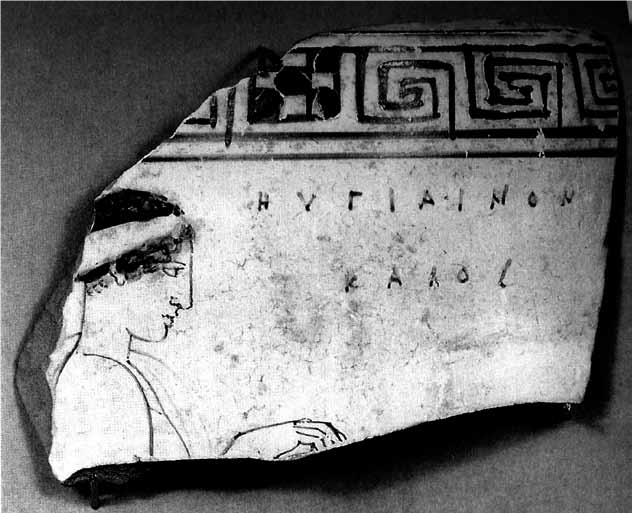
Figure 19: ‘Abbreviated’ sigma on Attic white-ground lekythos, c.450 bc. British Museum D49 (GR 1893.1115.7). Courtesy Trustees of the British Museum.
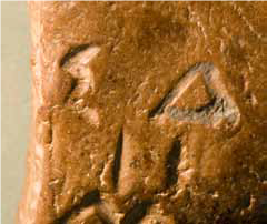
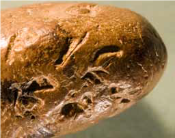
Figure 20: Clay ball, from Persepolis. Courtesy of Persepolis Fortification Archive Project, Oriental Institute, University of Chicago.
Two areas where conservatism can be seen however are religion and trade. While it is clear that the major polis cults did enjoy new developments, especially in monumentality of the architectural environment, at a more humble level it has been argued that the increase in quantities of small mould-made terracottas in many sanctuaries in the classical period reflects a concern for stability, not change, in cult and its attendant rituals (von Hesberg 2007). On what would appear to be a completely different level we may note the relationship, or lack of relationship, between vase shapes and their suitability for stacking on board ship, i.e. ‘progressive’ cooperation between potter and trader. It is a topic that needs greater attention than can be given here, but I just note two aspects that one might consider counter-intuitive. The shapes of storage or transport amphoras respond little to the requirements for easy packing until, in crude terms, the 3rd century bc (Johnston 1984). One type, from Mende (Figure 21), oddly enough one that is mentioned by Demosthenes in a court speech involving shipments, takes on even more ‘aesthetic’ shapes in the 4th century. Here it could be said to reflect the trend in shape development in Attic red-figured ware, to what one might fairly call Victorian values, with ever slimmer stems and flowering, fragile rims; yet the late red-figured krater is exported very widely, from Spain to the Black Sea. One might argue exceptions, for example the solid Castulo cup of the 5th century bc, but also remember the elegant stemmed kylix, in near mass production from c.550 until the 4th century bc (Shefton 1996; Figure 22). Not only transport, but kiln furniture is affected (see the highly intricate kiln supports required, and made, for the better firing of South Italian equivalents of later Attic red-figured pots at Metaponto [Cracolici 2003]).

Figure 23: Graffito under foot of Attic vase, from Athens (Immerwahr 1990: fig. 165; Lang 1976: C21). Agora Museum P5164.
In writing there are similar tensions between aesthetic concerns and practicality, and they receive similarly mixed solutions. An informal scribble on a sherd, of c.475–450 bc from the Agora at Athens demonstrates this wonderfully (Lang 1976: C21; Figure 23), with its scratched sketch of an official stone text, complete with grid for the lettering and the heading invoking the gods, albeit the rest of the text is far more in keeping with contemporary painted names on pots. Or one can cite (Figure 24) the use of truly monumental lettering, of a lapidary kind, in some ceramic texts, where smaller size and normally hastier script are otherwise found, all I think dedications to deities (Johnston 1997: 109–111; we can add to my list published there splendid unpublished examples on Panathenaic amphora(s) dedicated in the Athena sanctuary at Kamiros on Rhodes).
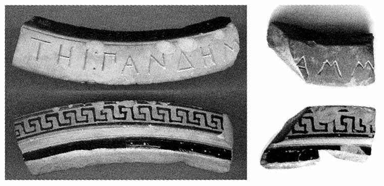
Figure 24: Dedication to Aphrodite Pandemos, from Naukratis, c.500 bc (Höckmann and Möller 2006: 16, fig. 11). British Museum GR 1900.0214.6 and Bonn, Akademisches Kunstmuseum 697.90.
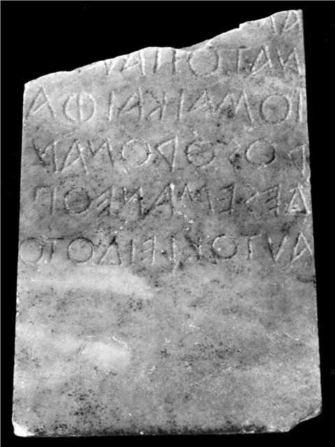
Figure 25: Grave stele of Autokleides, c.550–525 bc, from Athens (Jeffery 1990: pl. 73, 1). Epigraphical Museum of Athens 13474.
I finish with a stone text to demonstrate a final aspect that has consequences for our topic. It is a ‘speaking object’, though in fact a counter-example but an interesting one. A tombstone of c.540 bc, with a text inscribed such that it rises up from the ground, as if the dead were speaking (Jeffery 1990: pl. 73, 1); very often indeed the epitaphs do treat the stele in the first person, and we find the usage very widely spread in the Greek and Etruscan world from the 7th century. Here however, rather perversely it is the unknown reader of the text who is in the first person “I am in pain looking on the tombstone of young Autokleides” (Figure 25). The material effect of the words rising from the ground is inexplicably lost.
A broad range of related texts that offer names, but of a more casual nature are the identificatory labels that painters and sometimes gem-cutters and the like put on their figured scenes. From the beginning, around 700 bc on present evidence, painters tried whenever possible to begin the label as near to the head of the relevant figure as possible, as if he or she were speaking their name. I noted earlier that something approaching the cursive sigma can be found on painted inscriptions on mid 5th-century pots, but they are rare and isolated occurrences within a group which is noteworthy however for another aspect most of them share, in that they reflect the new aesthetic of the squared off stoichedon style, with labels very often related more to the surface than the figures, and there are hints that such usage may have been derived from large-scale wall or panel painting (Figure 19).
In sum we may see in the development of script in the classical period a similar neglect of ‘pure’ technology as in other areas of everyday life, as against the remarkable intellectual input into epistemology and the arts, as we would call them, not least in the words written in the seemingly still conservative scripts. The fact that many of those words were publicly uttered in somewhat basic theatrical surroundings, before the rise of the monumental theatre in the 4th century, is a further example of such social attitudes.
Concluding Remarks
With respect to the closer theme of this volume, I have considered a number of the issues arising from the use of different surfaces and their possible reflection in the script of the broad period, c.800 to 300 bc. Direct connections seem few and are sporadic; the Greek-speaking world adapted a Semitic ‘alphabet’ into its contemporary decorative tradition and the resulting letters in general terms changed but slowly thenceforth. Use of ‘brush and ink’ cursive forms, on whatever surface, is highly sporadic in that world until the 4th century bc. Some aids to reading, or ‘picking up’ the letters, are used; in the earlier part of the period these include the boustrophedon system and interpuncts, but both disappear by c.500 bc, when stoichedon writing would seem to have a blocking effect on more ‘fluid’ approaches. Cursive lettering does become more frequent in our preserved record in the later 4th century bc, largely, we must assume, through the influence of papyrus-written texts, even though these would by then have been in general use
for at least 200 years.
Notes
- The tomb, in a plot beside LeoforosVouliagmeni, southeast of the Akropolis, is essentially unpublished; apparently it contained no pottery, only a wide range of musical and writing instruments, but is stratigraphically connected with a 5th-century bc burial. I learned in 2010 that some inscribed parts do survive (Martin West pers. comm.; and see now Pöhlmann and West 2012).
- The present whereabouts of the piece are uncertain (John Tait pers. comm.), but we may note that Eric Turner saw two hands at work, one using a brush, the other a reed.
- I note here an example of surface being of importance to modern scholarship: those who advocate an early date for the transfer of the alphabet from the Levant to the Greek world (see Jeffery 1990: 426–427 for an overview) have argued that the Greek omicron with a central dot is a clear echo of the Semitic ayin, ‘eye’, which had lost that dotted iris by the 1st millennium bc. They are of course no such thing; all early omicrons, to my knowledge, do without it also.
References
Adiego Lajara, I. 1998. Die neue Bilingue von Kaunos und das Problem des karischen Alphabets. Kadmos 37: 57–79.
Adiego Lajara, I. 2007. The Carian Language. Leiden: Brill.
Agostiniani, L. 1977. Iscrizioni anelleniche di Sicilia: le iscrizioni elime. Florence: Olschki.
Avram, A. 2007. Some Thoughts About the Black Sea and the Slave Trade Before the Roman Domination (6th–1st centuries bc). In Gabrielson, V. and Lund, J. (eds), The Black Sea in Antiquity: Regional and interregional economic exchanges. Aarhus: University Press, 239–251.
Avronidaki, Ch. 2008. Boeotian Red-figure Imagery on Two New Vases by the Painter of the Dancing Pan. Antike Kunst 51: 8–22.
Bagnasco Gianni, G. 1996. Oggetti iscritti di epoca orientalizzante in Etruria. Florence: Olschki.
Bergk, T. 1878–1882. Poetae Lyrici Graeci (4th edition). Leipzig: Teubner.
Corbett, P. E. and Woodhead, A. G. 1955. A Forger of Graffiti. Annual of the British School at Athens 50: 251–265. DOI: http://dx.doi.org/10.1017/S0068245400018670
Cracolici, V. 2003. I sostegni di fornace dal kerameikos di Metaponto. Bari: Edipuglia.
Dana, M. 2007. Lettres grecques dialectales nord-pontiques. Revue des ÉtudesAnciennes 109: 67–97. Hiller von Gaertringen, F. 1898. Inscriptiones Graecae XII, 3, Part vii, Thera et Therasia. Berlin: Reimer.
Höckmann, U. and Möller, A. 2006. The Hellenion at Naukratis: Questions and observations. In Villing, A. and Schlotzhauer, U. (eds), Naukratis: Greek diversity in Egypt. London: British Museum Press, 11–22.
Immerwahr, H. 1990. Attic Script. Oxford: Oxford University Press.
Inglese, A. 2008. Thera arcaica: le iscrizioni rupestri dell’agora degli dei. Tivoli: Tored.
Jeffery, L. H. 1990. The Local Scripts of Archaic Greece (revised edition with supplement by A. W. Johnston). Oxford: Oxford University Press.
Johnston, A. W. 1980. Trademarks on Greek Vases. Warminster: Aris and Phillips.
Johnston, A. W. 1984. The Development of Amphora Shapes: Symposium and shipping. In Brijder, H. (ed.), Ancient Greek and Related Pottery (Proceedings of the International Vase Symposium Amsterdam 1984). Amsterdam: Allard Pierson Museum, 208–211.
Johnston, A. W. 1985. A Fourth Century Graffito from the Kerameikos. Athenische Mitteilungen 100: 283–307.
Johnston, A. W. 1996. Note on the Graffito. In Coldstream, J. N. and Catling, H. W. (eds), Knossos North Cemetery: Early Greek tombs (British School at Athens, supplementary volume 28). London: British School at Athens, 463.
Johnston, A. W. 1997. All Runes to Me. In Nyström, S. (ed.), Runoroch ABC. Stockholm: Sällskapet Runica et Mediaevalia, 93–112.
Johnston, A. W. and Andreiomenou, A. K. 1989. A Geometric Graffito from Eretria. Annual of the British School at Athens 84: 217–220. DOI: http://dx.doi.org/10.1017/S0068245400020955
Johnston, A. W. and Jones, R. E. 1978. The ‘SOS’ Amphora. Annual of the British School at Athens 73: 103–141. DOI: http://dx.doi.org/10.1017/S0068245400006195
Kirchner, J. 1948. Imagines Inscriptionum Atticarum. Berlin: Mann
Lang, M. 1976. Graffiti and Dipinti (The Athenian Agora 21). Princeton: American School of Classical Studies at Athens.
Lang, M. 1990. Ostraka (The Athenian Agora 25). Princeton: American School of Classical Studies at Athens.
Lewis, D. M. 1977. Sparta and Persia: Lectures delivered at the University of Cincinnati, Autumn 1976 in memory of Donald W. Bradeen. Leiden: Brill.
Lloyd-Jones, H. and Parsons, P. (eds) 1983. Supplementum Hellenisticum. Berlin: de Gruyter.
Monakhov, S. Yu. 2003. Greceskie Amfori v Prichernomore. Moscow: Kimmerida.
Morpurgo-Davies, A. 1987. Folk-linguistics and the Greek Word. In Cardona, G. and Zide, N. (eds), Festschift for Henry Hoenigswald. Tübingen: Narr, 263–280.
Parkes, M. B. 2008. Their Hands Before Our Eyes: A closer look at scribes. Aldershot: Ashgate.
Pöhlmann, E. and West, M. L. 2012. The Oldest Greek Papyrus and Writing Tablets. Zeitschrift für Papyrologie und Epigraphik 180: 1–16.
Shefton, B. 1996. The Castulo Cup: An Attic shape in black glaze of special significance in Sicily. In Palermo, D., Gigli, R., and Caruso, F. (eds), I vasi attici ed altre ceramiche coeve in Sicilia: atti del convegno internazionale: Catania, Camarina, Gela, Vittoria, 28 marzo–1 aprile 1990 (Cronachedi Archeologia 29–30). Palermo: Nuova Graphicadue, 85–98.
Threatte, L. 1980. The Grammar of Attic Inscriptions, 1. Berlin: de Gruyter.
Turner, E. 1975. Four Obols a Day Men at Saqqara. In Bingen, J., Cambier, G. and Nachtergael, G. (eds), Le Mondegrec: pensée, littérature, histoire, documents: hommages à Claire Préaux. Brussels: Editions de l’Université de Bruxelles, 573–538.
van der Meer, L. 2007. Liber linteus Zagrabiensis: The linen book of Zagreb: A comment on the longest Etruscan text. Louvain: Peeters.
Verdelis, N., Jameson, M. and Papachristodoulou, I. 1975. Επιγραφαὶ Τίρυνθος. Αρχαιολογικὴ Εφημερίς, 150–205.
von Hesberg, H. 2007. Votivenseriationem. In Frevel, Chr. and von Hesberg, H. (eds), Kult und Kommunikation: Medien in Heiligtumem der Antike. Wiesbaden: Reichert, 279–310.
From Writing as Material Practice: Substance, Surface and Medium, edited by