
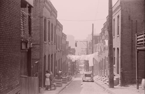
Exploring the ‘New Deal’ history of racial and ethnic discrimination in housing policy.

By Dr. Robert K. Nelson
Director, Digital Scholarship Lab
Head of Digital Engagement, Boatwright Memorial Library
University of Richmond

By Dr. Todd Michney
Associate Professor, School of History and Sociology
Georgia Institute of Technology

By Dr. Jeremy Scott Hoffman
Director of Climate Justice and Impact
Groundwork USA

By Dr. Helen Carmon Spink Meier
Assistant Research Scientist, Survey Research Center, Institute for Social Research
Adjunct Lecturer in Epidemiology, School of Public Health
University of Michigan
Introduction
In the 1930s the federal government created redlining maps for almost every major American city.
Redlining was the practice of categorically denying access to mortgages not just to individuals but to whole neighborhoods.
Between 1935 and 1940, an agency of the federal government, the Home Owners’ Loan Corporation, graded the “residential security” of thousands of American neighborhoods. By “security,” they meant the relative security or riskiness of those areas for banks, saving and loans, and other lenders who made mortgages.
For each of these cities, they produced maps showing those grades. Neighborhoods they deemed “best” and safe investments were given a grade of A and colored green. Those that were deemed “hazardous” were given a grade of “D” and colored red.
In most cases they also generated an “area description” for each of these neighborhoods providing descriptions of the houses, the sales and rental history, and of the residents.
If those residents were African Americans or, to a lesser extent, immigrants or Jews, HOLC deemed them a threat to the stability of home values and described their presence as an “infiltration.”
Redlining was legal and practiced for decades. It dramatically affected the relative wealth—as well as the health—of different racial groups in America. Its impact is still with us today.
Among the thousands of area descriptions created by agents of the federal government’s Home Owners’ Loan Corporation between 1935 and 1940, the one that was written for what is now called the Carver Heights neighborhood in Savannah, Georgia, stands out. HOLC staff members, working with local real estate professionals in each city—lenders, developers, and real estate appraisers—assigned grades to residential neighborhoods that reflected their “mortgage security” that would then be visualized on color-coded maps. Neighborhoods receiving the highest grade of “A,” colored green on the maps, were deemed minimal risks for banks and other mortgage lenders when they were determining who should receive loans and which areas in the city were safe investments. Those receiving the lowest grade of “D,” colored red, were considered “hazardous.” Conservative, responsible lenders, in HOLC judgment, would “refuse to make loans in these areas [or] only on a conservative basis.” HOLC created area descriptions to help to organize the data they used to assign the grades. Among that information was the neighborhood’s quality of housing, the recent history of sale and rent values, and, crucially, the racial and ethnic identity and class of residents.
The Savannah real estate professionals working with HOLC described the residents of Carver Heights as “a fair class of negroes and low type of white.”Originally, they assigned a grade of “D” to Carver Heights. But their “consensus of opinion later changed,” and they decided to assign it a “C.” The change of grade followed from a change of perspective. They made an effort to not just see the neighborhood from their viewpoint as white men. “In other words,” they explained in the neighborhood’s area description, “it was considered from a negro standpoint of home ownership, rather than a white, since there are more negroes than whites in the neighborhood.”
In none of the other cities surveyed by HOLC—more than 200 of them—is there any evidence of a comparable effort to consider a “negro standpoint.” Quite the contrary. HOLC’s field agents and the real estate professionals insisted that the residency of African Americans and immigrants, and to a lesser extent that of working-class whites, compromised the values of homes and the security of mortgages. In this they followed the guidelines set forth by Frederick Babcock, the central figure in early twentieth-century real estate appraisal standards, in his Underwriting Manual: “The infiltration of inharmonious racial groups,” Babock proclaimed, “tend to lower the levels of land values and to lessen the desirability of residential areas.”
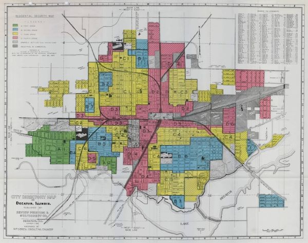
As you explore the maps and search the area descriptions in Mapping Inequality, you will quickly encounter exactly that kind of language, descriptions of the “infiltration” of what were quite often described as “subversive,” “undesirable,” or “inharmonious,” populations, for they are everywhere in the HOLC archive. Of the Mansion Flats neighborhood in Sacramento for instance, where “Italians predominate but with a Sprinkling of Mexicans, Negroes, and Orientals,” HOLC pronounced that “the subversive character of the population constitutes the area’s principal hazard. The area is accorded a ‘medial red’ grade.”
In the Tompkinsville neighborhood in Staten Island, “Italian infiltration depress residential desirability in this area.”In a south Philadelphia neighborhood “Infiltration of Jewish into area have depressed values.”The assessors of a Minneapolis neighborhood attributed the decline of a “once a very substantial and desirable area” to the “gradual infiltration of negroes and Asiatics.”
In Berkeley, California, an area north of UC Berkeley “could be classed as High Yellow [C], but for infiltration of Orientals and gradual infiltration of Negroes form south to north.” Such judgments were made in cities from every region of the country. The “infiltration of negroes” informed the grades of neighborhoods in Birmingham, Oakland , Youngstown, Indianapolis, Cleveland, Los Angeles, and Chicago; the “infiltration of Jews” or “infiltration of Jewish families” in Los Angeles, Binghamton, Kansas City, and Chicago; the “infiltration of Italians” in Akron, Chicago, Cleveland, and Kansas City. The infiltration of Polish, Hungarian, Czech, Greek, Mexican, Russian, Slavic, and Syrian families was cataloged in other cities, always lowering the grade of neighborhoods.
These grades were a tool for redlining: making it difficult or impossible for people in certain areas to access mortgage financing and thus become homeowners. The majority of areas marked as “hazardous” and colored red on the City Survey maps were white, often ethnic neighborhoods. But the brunt of redlining fell upon neighborhoods of color. African American neighborhoods, in particular, were all but universally categorized as “hazardous” regardless of the income or class of residents. Even the presence of a few families of color typically resulted in redlining. The grading of a small area in Tacoma, Washington, is an example. Though otherwise identical to the surrounding B-graded neighborhood of which it was a part, the area was assigned a D grade because “Three highly respected Negro families own homes and live in the middle block of the area…. While very much above the average of their race, it is quite generally recognized by Realtors that their presence seriously detracts from the desirability of their immediate neighborhood.” The maps reinforced and advanced this segregationist, discriminatory mindset where even the presence of a handful of “highly respected” middle-class African American families required an area to be categorized as a hazardous site for the investment of mortgage capital.
Redlining thus directed both public and private capital to native-born white families and away from African American and, to a lesser extent, immigrant families. As homeownership was arguably the most significant means of intergenerational wealth building in the United States in the twentieth century, these redlining practices from eight decades ago had long-term effects in creating wealth inequalities that we still see today. Mapping Inequality, we hope, will enable and encourage you to grapple with this history of government policies contributing to inequality.
The Reach of Redlining across Space
Most of the maps in Mapping Inequality were made by HOLC as part of its City Survey. Run by the HOLC’s Mortgagee Rehabilitation Division, the City Survey aimed to create security maps for every American city with a population of 40,000 or more. While a few cities of that size appear not to have been surveyed—Washington DC being the most conspicuous—the City Survey produced more than 200 redlining maps. HOLC’s City Survey maps and area description are the largest surviving collection of historical evidence about redlining.
But they were not the only redlining maps. The Federal Housing Administration (FHA) made redlining maps too. The FHA maps were more directly impactful than HOLC’s as they actively used them for decades to insure mortgages while HOLC did not use its maps in its own lending decisions. (Todd M. Michney’s essay “How and Why the Home Owners’ Loan Corporation Made Its Redlining Maps” provides a brief history of HOLC’s City Survey, how HOLC used its redlining maps, and the relationship between HOLC and the FHA.) The FHA reportedly destroyed its maps shortly after the passage of the Fair Housing Act; few survive today. Banks, savings and loans, and other mortgage lending institutions also made their own maps, some at the prompting of HOLC, which actively encouraged the making of “security maps” by institutions in the residential mortgage sector.
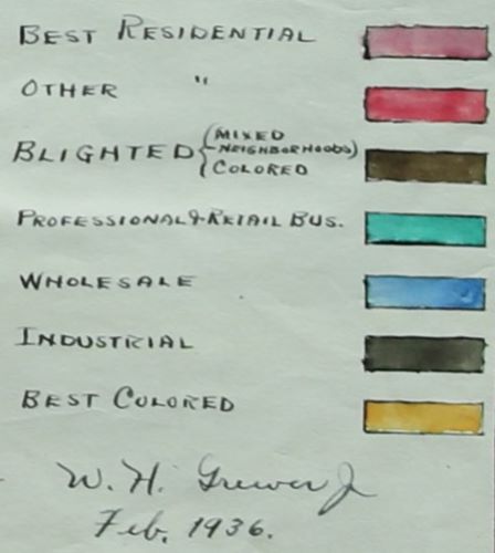
Many state HOLC offices also followed the lead of the national City Survey and made redlining maps for cities with populations under 40,000.Mapping Inequality includes more than a hundred maps that were not made as part of the City Survey. While it cannot definitively be said that all of the non-City Survey maps in Mapping Inequality were made by HOLC state offices, it seems very likely that almost all were. The categorical and cartographic uniformity of maps in certain states makes it clear that they were produced by the same people or using the same guidelines. South Carolina’s maps all used similar categories, and they appear to have all be created by a Columbia real estate manager, W.H. Greevey, Jr., who signed three of them. The eleven maps for Vermont all are drawn on blueprint paper and all use categories ‘#1,” “#2”, and “#3,” with a single city having an additional “#4” category. The eight maps for Arkansas all use three residential categories (“Best,” “Second Best,” and “Blighted”) with a consistent color schemed (green, yellow, red). The maps of Colorado cities and towns share much in common too. The fact that these maps are in the HOLC materials at the National Archive is additional evidence that they were made by state HOLC offices and not private banks and lenders.
A few of these redlining maps look much like those made through the City Survey. Huron and Sioux Falls South Dakota, for example, both used the same “Best”/green, “Still Desirable”/blue, “Definitely Declining”/yellow, and “Hazardous”/red categories and color scheme. Some other maps use categories that resemble HOLC’s. The map for Fort Collins, Colorado, for example, has four categories—”First Grade” to “Fourth Grade”—and uses the same colors; but while “Fourth Grade” is red and “Third” yellow, “First” and “Second” are reversed when compared to the City Survey maps, the former blue, the latter green.
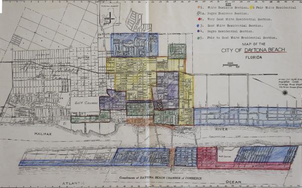
But non-City Survey maps that can be linked one-to-one with HOLC’s four categories are the exception. And none, as far as we know, had anything resembling area descriptions that provided quantitative and qualitative information about the areas. Some information that HOLC included in the area descriptions was instead conveyed by the categories on the maps themselves, particularly information about race. Most of the maps included categories that specified race, categories like “Negro Residential,” “Best Colored,” and “Cheap White Section.” All seven of the maps for cities and towns in Florida, for example, had a “Negro Section” or the equivalent. Much like the City Survey maps, none of the Florida maps made any class distinctions for African American neighborhoods. Those distinctions were reserved only for white neighborhoods. For example, on the map of Daytona Beach, Florida, the “Negro Residential” areas were colored purple; four other colors were used for “White Residential Sections,” which were broken down from “Very Good” to “Good” to “Fair to Good” to “Fair.”
Intriguingly, though, some of the maps did draw such distinctions for African American neighborhoods. Seven of the eight South Carolina maps included a category like “Best Colored” or “Best Negro,” all colored yellow, to distinguish presumably middle-class African American areas from lower-income areas. With singular exceptions like Savannah, in the City Survey HOLC made few distinctions related to income for neighborhoods of color. The non-City Survey maps for South Carolina show an alternative redlining evaluation model, one that was obviously not race neutral (quite the opposite), but one that was also not income- or class-blind for African American neighborhoods. Put another way, while the South Carolina maps are unquestionably the products of a discriminatory, segregationist mindset, unlike the City Survey maps they foregrounded class differences in African American neighborhoods. They could be read in a way that the City Survey maps could not: to conclude that mortgage capital might securely and profitably be extended to some African Americans inhabiting neighborhoods that the mapmaker judged to be the “Best Negro” or “Best Colored” areas.
Individually, these maps offer opportunities for cities and towns for which HOLC did not make a map to recognize and reckon with the history of redlining and racial discrimination in real estate policies and practices in their communities. Considered together with the City Survey maps, they present a window into a more complex and varied history of redlining.
The Reach of Redlining across Time
While the City Survey maps are incredibly rich historical sources that can be productively used to answer any number of questions, the simplest and arguably most important historical reality they make crystal clear is the endorsement and advocacy of racial discrimination in the real estate industry by the federal government. For a third of a century the FHA would put the redlining agenda the HOLC materials reveal into practice. The ways the FHA extended mortgage guarantees reinforced racial segregation and extended government benefits to white families that were all but unavailable to African American families. Only with the passage of the Fair Housing Act in 1968 would these discrimatory policies and practices become illegal.
But that legislation hardly undid the spatial and racial inequalities in American cities. Using the spatial data from Mapping Inequality, researchers in a variety of fields have shown how tight correlations between the redlining grades drawn nine decades ago and the patterns of inequality in American cities today. Environmental researchers have shown that redlined areas are hotter, are more polluted, have fewer trees than those that received high grades. Health researchers have shown that people living in redlined areas are less healthy, more likely to have asthma, more likely to experience pre-term births, less likely to have easy access to nutritious food, and more likely to die early deaths. Mapping Inequality now includes two essays exploring the legacies of redlining, one by J.S. Hoffman on the environment, the other by Helen C.S. Meier on health.
For sure, redlining was not the sole cause these contemporary patterns of inequality. But these maps are a useful proxy for spatial patterns of systemic racism in mid-twentieth-century American cities. After all, what is more systemic than the policies and practices of the government and the financial sector. As such, the materials included in Mapping Inequality offer an opportunity to explore the history of redlining in the Depression era and the entrenched contours of inequality that continue to shape American cities today.
How and Why the Home Owners’ Loan Corporation Made Its Redlining Maps
Like millions of other visitors to the Mapping Inequality website, you’ve seen the scanned versions of these maps created by the federal government during the Great Depression, rating the supposed riskiness of mortgage-lending in the various neighborhoods of almost every major U.S. city. Perhaps you’ve also read some of the accompanying “area descriptions” that expose the skewed logics underlying these neighborhood ratings, in which evaluators frequently wrote in racist, classist, and xenophobic language about the people who lived there. You may also have encountered reporting on how this practice of “redlining”—lenders marking in red the neighborhoods they rated the lowest—correlates with unfavorable health, educational, financial, and other inequalities that persist into our present day.
A government agency called the Home Owners’ Loan Corporation (HOLC) made these maps, as part of its City Survey from 1935 until 1940. The idea for the survey was conceived by a small group of high-ranking administrators close to John H. Fahey, Chairman of the Federal Home Loan Bank Board (FHLBB) that oversaw HOLC. The Federal Home Loan Bank System that the FHLBB governed, established in mid-1932 largely at the behest of the real estate and savings and loan (S&L) industries, was the first of several Depression-era reforms aimed at shoring up the housing market. S&Ls, small local banks that specialized in lending to homebuyers of lesser means, comprised the overwhelming majority of the institutions in the resulting system optimized to their special needs. Similar to large banks affiliated with the Federal Reserve, S&Ls approved for FHLB membership could get advances of cash, funds they needed to replenish their working capital and cover any withdrawals by their depositors. After 1934, these affiliated S&Ls’ mortgages were also insured by the Federal Savings and Loan Insurance Corporation. The intention behind such reforms was to reorganize the mortgage market around longer-term, lower-interest loans that were considered more “secure” for borrowers, lenders, and investors alike. One means used to pursue this goal was systematizing racial discrimination in mortgage lending. Racial prejudice had always impaired African Americans’ access to credit, but now it would be encouraged and indeed, enforced as federal government policy.
The HOLC was established through the Home Owners’ Loan Act, an emergency measure passed during the New Deal’s “First Hundred Days” in early 1933. Its objective was to aid homeowners who were already behind on their mortgage payments—and just as importantly, to bail out their creditors and thereby reboot the Depression-hit housing market. In exchange for their mortgages, the government offered mortgagees (lenders) bonds worth up to 80 percent of a property’s value, but not to exceed $14,000. HOLC in turn refinanced homeowners with new mortgages at 5 percent interest (later reduced to 4.5 percent), to be repaid over a fifteen-year interval—far more generous than the typical financing available at the time, which was short-term (two to five-year) “balloon” mortgages at interest rates from 6 to 8 percent. HOLC sought immediate results—in other words, it was driven by a political imperative to aid homeowners (along with their creditors) as speedily as possible. From 1933 to 1936, HOLC refinanced just over 1 million mortgages on around one-fifth of the country’s owner-occupied houses. The initial impetus for the City Survey was HOLC’s desire to figure out what mortgages it had purchased and where exactly the properties were located, with a goal of estimating the likelihood of repayment. And despite the survey’s flawed assumptions about what kinds of neighborhoods and people represented poor credit “risks,” the concern was real—amid the continuing reality of a severe economic depression, one out of every five borrowers who took out HOLC mortgages would ultimately default on their obligation.
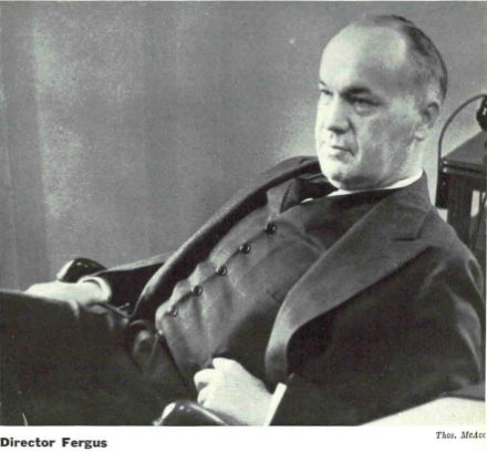
By early 1935, HOLC had a “Mortgagee Rehabilitation Department” in place; at the time, the FHLBB was concerned that Congress would authorize another bailout of underwater mortgages, thereby adding to HOLC’s already massive inventory. One of this department’s three members—Corwin A. Fergus, a Columbus, Ohio lawyer, realtor, and banker—would go on to oversee HOLC’s Mortgagee Rehabilitation Division (MRD) when the FHLBB formally established it in August 1935. Prior to the City Survey’s launch the following month, Fergus hired an initial batch of thirteen field agents, one for each of the eleven HOLC Regions except in the heavily-urbanized Northeast where he posted two each. Unsurprisingly, these men were all white and native-born, most of them college-educated. All but one had previously held jobs in banking and finance; the sole exception was Clifford C. Boyd, a former realtor from the same Columbus firm as Fergus. Boyd would take over as the City Survey’s manager in September 1936, following Fergus’s promotion to head HOLC’s Division of Research and Statistics.
Making these maps was not an end in and of itself; rather, they were just one component of the extensive reports that HOLC-MRD field agents produced for the City Survey. The project was tasked to survey all U.S. municipalities with 1930 populations over 40,000, and during its operations it surveyed 239 cities in total (as well as resurveyed two dozen). For each locale, field agents first identified a representative cross-section of lending institutions and real estate companies, using available published reference sources and recommendations from individuals in their own social and professional networks. They then sent out questionnaires to their prospective informants, with the upper limit being a maximum of 200 for large cities like Chicago or Los Angeles. The sorts of questions asked concerned individual institutions’ lending practices and the shape of the local real estate market. The agents would then travel to the cities in their region to collect further information, and conduct detailed follow-up interviews with select informants (up to a couple dozen). After spending from around three to six weeks in each city, the field agents produced sizeable reports diagnosing the “health” of the real estate market and mortgage lending in each locale, which they passed along to a select group of high-ranking FHLBB officials in Washington.
While the so-called mortgage “security” (i.e. redlining) maps were but one exhibit in these City Survey reports, from the very beginning they generated disproportionate attention and interest. In addition, the HOLC-MRD field agents utilized a different, more selective process to produce them. For each city, field agents would work with up to a dozen informants who were specialists in real estate appraisal employed at local federal housing agency offices, insurance companies, and prominent banks and S&Ls. Agents also consulted with leading real estate firms in each city, yet maintained some skepticism regarding these realtors’ tendency to overrate their own companies’ properties for sale. In large cities like Cleveland, individual realtors sometimes also wrote the “area descriptions” to accompany the maps.
Making the security maps was a tedious and technical process that, at least initially, limited the number of copies HOLC could produce. For the earliest versions made starting in late 1935, the process was as follows. First the field agents had to acquire up-to-date base maps on the scale they desired, which were sometimes difficult to find and often quite expensive. After consulting with their informants, they would line out the various neighborhoods to be rated by a series of four grades, typically in colored pencil. Initially, some field agents assigned African American residential areas in southern cities to a fifth, “F” (i.e., “other”) grade; after the survey’s first month, however, Fergus decided that Black neighborhoods should be collapsed into the “D” (red) category, in other words, “hazardous” for lending. Business districts and underdeveloped areas were also initially assigned a color, until Fergus decided these areas should not be rated (and be distinguished using hatching and cross-hatching). On a map template either on location or back at headquarters, field agents or a Washington office worker would outline the so-called security areas in India ink, and complete any other necessary labeling. Using the “photostat” process, the map template was then photographed to produce a negative, which could be used to make prints onto photosensitive paper that had to be hand-finished in watercolors. Not until 1937 did HOLC switch to the “Planograph” process (photo-offset lithography) which produced faster, cleaner, and more uniform-looking results.
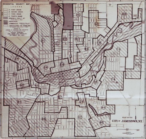
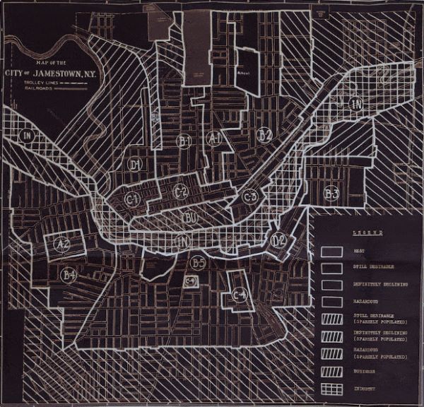
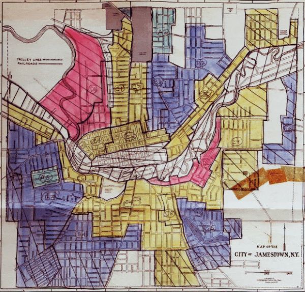
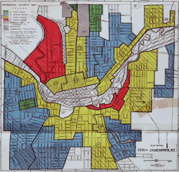
Now that we know who made these maps and how, questions remain as to why HOLC produced them and what purposes they ultimately served. How, also, should we contextualize these artifacts as products of the time and circumstances in which they were created? This is where some significant misunderstandings about HOLC’s City Survey program and what role its maps played in the emergence of inequitable housing outcomes have come in.
The first thing to understand about the City Survey’s security maps is that they were not unique—rather, they are merely the best-preserved and most widely-known examples of a technology that was proliferating around the time of their creation in the mid-late 1930s, and which would become even more widely implemented over the succeeding decades. Up to that point, most mortgage-lending had been done at the local level—that is, by S&Ls which lent on a face-to-face basis to borrowers living nearby, or else by individuals who extended loans through the intermediary of a mortgage broker. However, amid a booming economy and surging new construction during the 1920s, life insurance companies that operated on a state or national level were seeking profitable new investments. According to HOLC-MRD staffers themselves, it was life insurance companies who pioneered the use of such maps to categorize the mortgages on properties they purchased in distant locations sight unseen. Nor was HOLC even the first New Deal government agency to make redlining maps. That ignominious distinction belongs to the Federal Housing Administration (FHA), which soon after its creation in 1934 began using the exact same method to determine where it would insure mortgages. Mainstream banks were thinking similarly, and so adopted the practice for their own lending decisions, well into the post-World War II era until the 1968 Fair Housing Act formally outlawed explicit racial discrimination in mortgage lending.
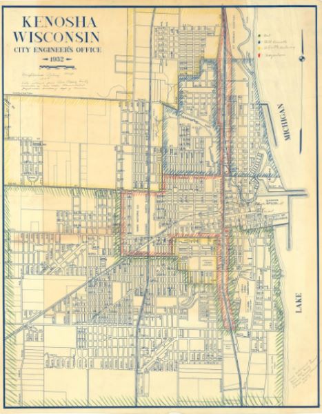
Second—and perhaps ironically, considering the proliferation of this discriminatory lending practice—it is important to understand that HOLC did not use this particular set of redlining maps to deny anyone access to financing. That is because work on the City Survey did not commence until September 1935, by which point HOLC had already closed 90 percent of its approximately one million mortgage refinancing loans. The deadline that Congress set for HOLC applications was June 1935, several months before work on the City Survey and its redlining maps even began. By the time the first batch of maps was available, in fact, fully 97 percent of the agency’s refinancing loans had already been closed. This helps to explain the fact that HOLC refinanced nearly 24,000 African American homeowners, which might seem counterintuitive but actually makes sense if we understand the program’s significance as a giveaway to lenders who had often financed Black borrowers on exploitative terms. Also, even though the City Survey maps were not yet available when HOLC was making loans, it nevertheless required applicants to state their race and also noted the neighborhood “trend,” on the assumption that an increasing Black population could only be detrimental.
In what may come as a further surprise, the resulting maps were not widely circulated, with access limited to select government circles. During the first six months of the City Survey, higher-ups instructed the MRD to keep its work strictly confidential, authorizing only the five members of FHLBB’s governing board to view the resulting reports. This policy made it harder for the field agents to complete their work; because they were not fully briefed on the project, HOLC’s Regional Managers were initially rather uncooperative, providing the MRD agents with only a bare minimum of clerical support. In February 1936, Fergus secured permission to share two copies of each finalized city map, one with the Regional Manager and the other with the State Manager in the corresponding geographic territory. In all, HOLC would produce six full sets of its City Survey maps over the duration of the project; besides those given to the Regional and State offices, HOLC kept three on file at HOLC headquarters and passed the remaining set directly to the FHA. Since 1935, that agency had been producing its own “Housing Market Analysis Maps,” which unlike HOLC it did use to deny its mortgage insurance guarantees.
None of the private industry consultants who had helped HOLC make its security maps were allowed to receive copies of the finished product. However, HOLC used other channels to disseminate its racist theories about property values as well as its mapmaking methodology. For starters, the City Survey is best described not as “top secret” but rather as an “open secret” because of how the government relied on private industry to supply the information it sought. Fergus once stated that 10,000 individuals had been approached through the project, with hundreds of them consulted in producing the security maps. Even though sharing the finalized maps was not allowed, the City Survey’s managers noted a “constant demand for copies from that part of the public which was familiar” with the project. Furthermore, both HOLC and FHA promoted the use of redlining and related racist practices to the real estate industry in other ways. One was through direct outreach to private organizations like the American Institute of Real Estate Appraisal (AIREA) and the Society of Residential Appraisers (SRA), founded in 1932 and 1935 by the National Association of Real Estate Boards and the U.S. Building and Loan League, respectively. AIREA and SRA members participated in HOLC- and FHA-sponsored workshops on supposed best practices that included racist approaches to valuing and selling real property. Most ambitiously, HOLC and FHA joined with AIREA and SRA to hold a National Appraisal Forum in late 1937.
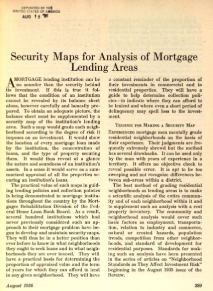
At this Washington, DC conference attended by over 1,000 individuals from the real estate and home finance industry, Philadelphia’s security map was on prominent display among the exhibits; in addition, Fergus delivered a presentation on the City Survey, even using Dayton, Ohio’s map as an onstage visual aid. High-ranking administrators with FHLBB-HOLC and FHA also encouraged racist thinking about real estate value through articles published in trade journals, including their own publications Federal Home Loan Bank Review and Insured Mortgage Portfolio. Notably, the magazine Architectural Forum published a 1938 illustrated feature on the City Survey that included a “Security Area Map for a Hypothetical City.” In sum, the methods that HOLC used to encourage the spread of redlining were more indirect than is commonly assumed, but quite insidious nonetheless.
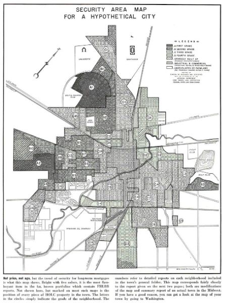
A final point worth mentioning is that HOLC almost certainly used the City Survey maps for discriminatory purposes after completing its initial 1933-1936 “rescue” phase. HOLC was designed to expire in 1951, fifteen years after its last mortgages were finalized in mid-1936. After an initial grace period, the agency began to foreclose on its mortgagors (borrowers) who were unable to pay on their debt. Early in the City Survey, the MRD had discovered that the best records of repayment were not always in their highest-rated (“A” or green) areas as predicted, but sometimes in the lowest-rated (“D” or red) areas, for example in Boston. In other words, their entire hypothesis about mortgage “security” and what kinds of people were likelier credit risks did not conform to observed reality. This revelation did not motivate HOLC to rethink its racist assumptions, however. In the event of foreclosure, HOLC would put the property up for sale, but forbade African Americans from buying in white-majority neighborhoods. This policy stood at least until 1943, when a Black veteran won a court case enabling his purchase of a HOLC property in an otherwise all-white West Philadelphia neighborhood. HOLC likely used its City Survey maps for such denials or put them to other discriminatory purposes—such as determining which S&Ls would be eligible to join the Federal Home Loan Bank System and thereby receive FHLBB backing based on where they had made their mortgages. More research will be needed to clarify HOLC’s full role in furthering race-based housing inequality, especially in its later years which historians have only recently begun to study.
There is still more to be learned about HOLC’s role in furthering race-based housing inequality, especially in its later years after the City Survey concluded in 1940. But here’s what we know so far. HOLC took race into account in all of its operations from the outset, despite issuing its own loans before it made these now-notorious maps. Most importantly, HOLC collaborated with the FHA and the real estate profession to establish both racist thinking about property values and discriminatory lending practices as industry-wide norms, thereby contributing to a racial housing and wealth gap which persists into our present day.
Hotter, Wetter, Sneezier, & Wheezier: Present-day Environmental Disparity Among HOLC Neighborhoods
Whether they’re walking, biking, bussing, or driving through virtually any city in the United States, people tend to make the same sorts of observations when considering any particular neighborhood’s environmental quality: wealthy areas—which tend to have disproportionately monolithic non-Hispanic white populations—are quiet, shaded by mature trees, and defined by large single-family houses occupying larger-than-average tracts of land, while just a few blocks away, poorer neighborhoods—which also happen to be communities of color—have many fewer trees, tend to have more multifamily dwellings, and are choked with traffic (or, are at least more proximal to arterial roads and freeways). This is largely if not entirely by design. These virtually ubiquitous socioeconomic and racial neighborhood associations are in no small way the products of iniquitous housing and urban planning policies that helped produce and protect environmental amenity for wealthy residents while exposing their marginalized neighbors to disproportionately high environmental burdens.
In 2017-2018, I led a team of scientists that used the HOLC redlining maps to analyze the links between discrimination in the twentieth-century housing markets and contemporary public health stressors. We specifically analyzed “heat islands,” or a phenomena in which built environments in human settlements (low-albedo and impervious land covers) elevate air temperatures relative to their surrounding non-urbanized surroundings. We had uncovered extreme differences in air temperature within several US cities (Shandas et al., 2019) and decided to map land surface temperatures derived from remotely-sensed satellite data in all of the HOLC cities. Our results (Hoffman et al., 2020) were quite staggering: in 94% of the HOLC cities, formerly “redlined” (D-rated) areas were significantly hotter during the summer when compared to their “greenlined” (A-rated) neighborhoods, and nationwide this difference exceeded 5°F on average. These patterns were largely explained by a predominance of impervious surfaces in the formerly redlined areas and extensive tree canopy coverage in the formerly greelined areas.
While we were among the first to analyze associations between the HOLC maps and present-day environmental disparities, we were not the last. In the past few years, our findings have been widely confirmed using a variety of data sources (Wilson et al., 2020; Mosiniak, 2021; Li et al., 2021; Locke et al., 2021; Nardone et al., 2021; Nowak et al., 2022). Additionally, our understanding of the acute social, climate, and health implications of these neighborhood-scale environmental disparities has been enriched by new scholarship linking discriminatory housing policies such as HOLC and FHA redlining, racial housing covenants, and blockbusting to present-day environmental inequality and downstream public health implications. At the risk of this essay being significantly deficient in its treatment of late-breaking literature, there have been two recent reviews (Lee et al., 2022; Swope et al., 2022) that largely have captured the near-universality of the cross-sectional patterns we reported: there are higher present-day climate-related health risks in formerly redlined neighborhoods, these risks reinforce cyclical generational effects, and there are higher rates of poor health outcomes due to these risks and pressures in these same neighborhoods. These findings underscore an inequitable distribution of present-day climate risks that, depending on the level of human-caused global warming that is ultimately allowed to occur, will continue to worsen into the future without considerable and proactive adaptation and mitigation of these risks.
While such findings suggest a causal link between twentieth-century racist housing policies and practices and twenty-first-century environmental disparities, the lack of time-dependent environmental data—namely land use, land cover, tree canopy, imperviousness, and other datasets—makes establishing the precise causal relationship between the two difficult. Indeed, it is important to recognize that social science and history researchers have maintained that relying solely on HOLC redlining maps—which were one of a slew of racially-motivated tools to codify residential segregation—to investigate environmental disparity obscures and simplifies the institutionally-supported roots of neighborhood trajectories in urban spaces, and may not have had the impact that many physical sciences studies like ours presuppose (Hillier, 2003; Fishback et al., 2020; Markley, 2023). While some economic (Aaronson et al., 2021) and now even environmental-stressor (Cushing et al., 2022; Salazar-Miranda et al., 2022) research has been able to assess some level of time-dependent evolution of environmental indicators with respect to particular aspects of these neighborhoods, historical environmental data (especially of the resolution commonly achieved from remotely-sensed data today) is unlikely to become available.
However, the HOLC archive itself may be a useful source of evidence about environmental disparities nearly a century ago. The ways the HOLC assessors characterized neighborhoods’ environments can serve as a baseline for qualitative comparison of today’s environment with that of the early twentieth century. We present here a novel analysis of the text included in these HOLC reports.
Some text-mining techniques can help us see broader patterns in the HOLC “Area Descriptions” (ADs). By using clustering algorithms that seek to establish the “sentiment” from a collection of words—in this case, the Area Descriptions (ADs) for the majority of areas HOLC graded—we can establish at least some semblance of what these areas “looked like” from the perspective of the assessors during the 1930s, well before land use maps and aerial photography began to define how geographers and climate scientists understand the distribution of environmental amenity in US cities. Using a naive bayes classifier on these ADs, we create a classifier for each neighborhood grade, A-D. We used unigrams and bigrams (single words and two-word sequences appearing next to one another) and did nothing to prevent bigrams from spanning multiple text fields. We then run each ngram that appears at least 25 times in the ADs through the classifier as a one or two word document to get its distribution odds for the grades, sort those to determine the ngrams most predictive of each grade, and subjectively analyze the list for environmental contexts. In effect, we are generating a list of the most-common words used to describe the neighborhood by its HOLC assessor at the time of the maps’ genesis. We then scanned each of the distributions for “environmental” words (importantly excluding words about housing, population, residents, economics, etc.). We then passed these lists into a word cloud generator, comparing the most common environmental words used to describe A-B neighborhoods to the most common environmental words used to describe C-D neighborhoods.

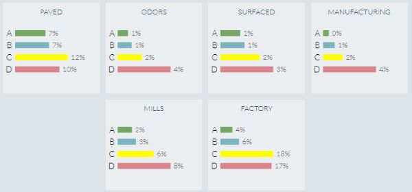
These visualizations of these commonly-used words present a strikingly vivid contrast between these neighborhoods at the time of the HOLC assessments. Formerly A- and B-rated neighborhoods, at the time of HOLC assessment, were already commonly described with words such as “wooded,” “shade,” “golf,” and “trees,” (Figure 1) suggesting a high level of greenness even in the early 20th century, as they still have today (Nardone et al., 2021), potentially reflecting the movements toward maintaining canopy health and tree planting that were concentrated in these areas through the years (Hoffman et al., 2020) and that the size of their lots have remained relatively unchanged. Many of these trees are likely the oldest trees remaining in the HOLC-graded neighborhoods, as indicated by their diameter and height (Burghardt et al., 2022; Esri ref). Meanwhile, formerly C- and D-rated neighborhoods were referred to with words like “paved,” “odors,” “surfaced,” and “manufacturing,” indicating a high level of imperviousness and its impact on temperatures even at the time of HOLC assessment. These patterns remain today, and recent findings show that over time, more power plants were disproportionately sited near these lower-graded neighborhoods relative to their higher-rated neighbors (Cushing et al., 2022), adding to the disparity in air quality that echoes words used in the 1930s like “mills,” “factory,” and “manufacturing.” It has also been shown that post-HOLC, urban renewal programs and interstate highway building were concentrated among formerly redlined areas and not within formerly green- and blue-lined neighborhoods (Townsend, 2020; Archer, 2020; Kim, 2021), adding to the present-day air quality (Lane et al., 2021) and asthma prevalence disparity (Nardone et al., 2020) between these neighborhoods. Moreover, other scholars have reflected on the persistence of these environmental amenities as very likely linked with industrial era development patterns that privileged wealthier communities to move westward out of intensifying pollution in cities in the US and abroad. So, while present-day studies of cross-sectional environmental comparisons may be just a snapshot of inequity, we know from multiple lines of evidence that environmental disamenities were concentrated, intentionally, in redlined areas before and after they were redlined.
In the time since our publication (and the many others), public, private, and governmental interest has galvanized around nature-based solutions to these disparities, which can ameliorate many stressors at once. Research has shown that this enthusiasm for solutions like green infrastructure can yield appreciable public health benefits for marginalized communities, (among others, South et al., 2018, 2020). Such results are encouraging, though many concerns remain that such interventions might trigger so-called green gentrification that displaces residents from their neighborhoods after investments in nature-based solutions improve the livability and quality of neighborhood amenity. Recent policy developed at the federal level—e.g., the SHADE Act, Justice40, the Inflation Reduction Act—offers some hope about collective action to mitigate environmental and health disparities. But much care is needed in implementing these programs, lest we recreate the spatiotemporal damage of redlining. It’s not enough to just improve the environment in isolation from the plethora of other generational traumas and damages present in these communities; the people living in these communities need to direct, create, and benefit from those improvements. To do that, it is essential that we center their voices and visions at every stage from planning to implementation to evaluation and reimagination.
Redlining and Health
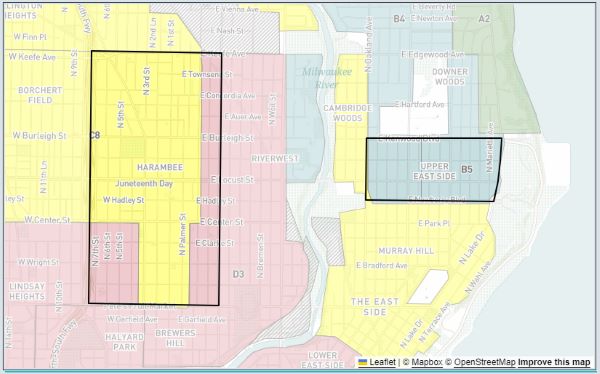
Across the landscape of US cities, health outcomes vary markedly. The Upper East Side neighborhood of Milwaukee, Wisconsin, for example, has lower prevalence of asthma, cancer, diabetes, high blood pressure, kidney disease, mental health problems, obesity and pulmonary disease than the Harambee neighborhood, despite their close proximity (Figure 1). When we are confronted with the obvious, deep spatial inequality in health outcomes, the natural question is to ask, “Why?” Why is zip code a better predictor of health than genetic code?
Neighborhood of residence represents more than just a geographic location. Neighborhoods are racially and economically segregated, and place-based differences in health are strongly correlated with social inequalities and race/ethnic differences in health. US metro areas are more segregated than ever before. Segregation is associated with strong differences in neighborhood resource distribution, concentrated disadvantage and health.1-5 Specifically, research has linked racial residential segregation to greater cardiovascular disease6, hypertension7, 8, diabetes8, obesity9, asthma10 and many other adverse health conditions.
A stark example of segregation and health is Detroit, Michigan which is 78% Black. But the broader Detroit metro area is only 23% Black, making it one of the most segregated areas in the United States. Inequity mirrors racial residential segregation in the region; the 2019 median household income for Detroit residents was just over half ($33,970) the median household income for the Detroit metro area ($63,470). The average home value in Detroit (2019: $99,790) was less than half the average home value in the Detroit metro area (2019: $234,420). Unsurprisingly, Detroit residents have a lower projected life expectancy and greater infant mortality, two key population health metrics, than the surrounding county and the state of Michigan.11
We often think of health as something intrinsic to the individual—what this person eats and how much that person exercises. But health is arguably more the result of societal systems.12 Current disparities in the distribution of health outcomes across US cities are driven by inequalities in social and economic resource distribution, which is the result of past and present structural factors that shape neighborhoods. Not least of these factors is historic governmental or institutional policies that were either explicitly or implicitly racist. Said simply, race/ethnic and social characteristics of neighborhoods (and as a consequence health inequalities) are not random but the products of design.
Historic redlining, a form of structural racism in the housing market, is likely one key determinant of inequalities in present day place-based social and economic resource distribution, and, as a result, neighborhood health disparities. It certainly was not the only determinant of inequality, but it is perhaps the one for which we have the best dataset. Between 1935 and 1940, the Home Owners Loan Corporation (HOLC) created residential security maps of over 200 major U.S. cities that graphically represented their assessment about the relative risk of lending in different areas over the life-span of 15- or 20-year residential mortgages.12 The maps were color-coded. Four hierarchical risk categories were used: green represented “A” grade, which was considered the “Best” with minimal risk; blue represented “B” grade, or “Still Desirable”; yellow represented “C” grade, or “Definitely Declining”; and red “D grade” indicated “Hazardous” areas with the highest perceived risk to lenders. The HOLC field agents collected data including housing conditions, access to recreational and other amenities, and proximity of environmental burdens and benefits to inform these grades. They also collected data about the racial, ethnic, and class identities of residents. People of color, Jews, and immigrants were typically characterized as “undesirable” or “subversive” populations that compromised both short-term and long-term property values.12,13 The HOLC materials are explicit in expressing racist ideas and judging neighborhoods with African Americans or immigrants as hazardous investments because of the racial and ethnic identities of their residents. A wealth of research has shown the persistence of economic and social disadvantage in most historically redlined neighborhoods to this day. Formerly redlined neighborhoods are more likely to have higher poverty, higher percentage minority population, lower median household income, higher prevalence of renting and lower educational attainment than non-redlined areas.13
Since the Mapping Inequality project digitized the HOLC maps, research on redlining and neighborhood health factors has skyrocketed, particularly since 2020. With the renewed focus on racism and structural bias in many areas of society since that time, researchers have sought to understand structural drivers of health. Structural racism is “racism that is not simply the result of private prejudices held by individuals, but is also produced and reproduced by laws, rules, and practices, sanctioned and even implanted by various levels of government, and embedded in the economic system as well as in cultural and societal norms.”14 While some forms of structural racism, including mass incarceration and police violence, are not well measured or do not have easily accessible datasources, the digitized and publicly available HOLC residential security maps are a historic record of structural racism easily accessed by researchers. Studies of redlining and health broadly fall into two major categories: health outcomes and environmental determinants of health.16
Redlining has been associated with a variety of present-day environmental determinants of health, ranging from urban heat and tree canopy coverage to air pollution and alcohol or tobacco retailer density.15 Using the redlining maps as a proxy for the spatial dimension of structural racism in twentieth-century American cities, these studies have advanced our understanding about how disinvestment and concentrated disadvantage resulting in an accumulation of place-based risk factors for poor individual and neighborhood health that has persisted over decades.
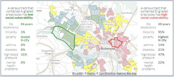
Studies of redlining and health to date are overwhelmingly focused on health indicators at the neighborhood-level (ecologic studies), most often proxied by census tract. Some studies were conducted within specific metro areas and others were national in nature. Evidence suggests that HOLC redlined areas are associated with many present-day health outcomes, including mortality, pre-term birth, stage of cancer diagnosis, COVID-19 infection burden, infant mortality, poor mental health, poor physical health, self-rated health, cardiovascular disease, hypertension and diabetes prevalence.15 The few studies looking at redlining and individual health outcomes are consistent with the neighborhood level findings, with the additional insight that poorer health outcomes may only be found for Black residents living in formerly redlined areas. Our own work has found that redlining was associated with present-day lending discrimination, and persistent lending discrimination was associated with poorer mental and physical health outcomes as well as higher infant mortality.13 Partnering with researchers at the National Community Reinvestment Coalition (NCRC) and the Mapping Inequality team, we produced a national study of redlining and current neighborhood social vulnerability, an index created by the Centers for Disease Control and Prevention, as well as higher prevalence of poverty, lower life expectancy and greater prevalence of asthma, diabetes, high blood pressure and mental health problems (Figure 2).16
What remains largely unstudied are the mechanisms by which historic redlining influence health. In a causal mediation analysis, Nick Graetz and Michael Esposito found that present-day life expectancy gaps between HOLC graded tracts were driven by economic isolation and disparate property valuation after HOLC redlining occurred.17 We hypothesize that the totality of racialized housing policies and practices, of which one piece is redlining, have systematically shaped patterns of neighborhood investment, resources distribution, availability of services, educational and employment opportunities, and increased exposure to health hazards, including dis-amenities and environmental hazards. Health is a product of environmental, social, and physical context and the systems that shape it.18, 19 Poor access to environmental amenities and health services, coupled with heightened environmental exposures, constitute a myriad of pathways by which structural racism operates to influence neighborhood context and health. The role of residential segregation in structural racism and the disproportionate impact on individual-level health outcomes has been insufficiently studied and represents a gap in knowledge for future studies to fill.
Because place impacts the health of communities and individuals, additional research needs to be conducted to understand how historic structural racism is embodied, or biologically incorporated into humans, to produce inequitable health outcomes. Nancy Krieger is a leading scholar on conceptualizing how societal systems of self-serving domination and privilege structure the embodiment of exposures that produce health inequalities.20 Krieger’s ecosocial theory of disease production posits that neighborhood and societal context, including structural racism, is embodied through social and biophysical processes and mechanisms.12 One potential pathway of embodying historical structural racism (redlining) is weathering. Weathering, first conceptualized by Arline Geronimus, hypothesizes that health inequalities are the result of the “cumulative impact of repeated experience with social or economic adversity and political marginalization.”21 Put another way, living in a racialized society with acute and chronic stressors requires persistent high-effort coping, which takes a toll physically on marginalized community members, resulting in greater morbidity and mortality than the majority racialized group in power, non-Hispanic Whites in the US.22 Therefore, as research in this space grows, we would expect to see redlining correlated with individual-level indicators of stress, such as cortisol or allostatic load.
A correlation between historic redlining, as a proxy of historic structural racism in the housing market, and present-day health indicators is supported by a growing body of research studies. Additional understanding of the impact of other historic policies, such as urban renewal, covenants, and steering practices on social and economic investment in neighborhoods over time is needed. It is more apparent than ever that interdisciplinary partnerships, with experts on epidemiology, urban planning, history, demography, sociology, geography, real estate, lending (to name a few) should be formed to tackle these research topics. Further, community experts are essential to contextualize results. While redlining was a federal policy, it was enacted locally and each city has its own story. For example, the HOLC area descriptions in Richmond, Virginia were explicitly anti-Black racism, whereas in Milwaukee the descriptions were mostly anti-immigrant and anti-Semitic racism. This speaks to the differences in demographics of the two cities in the 1930s. Milwaukee’s Black community grew in the Second Great Migration, which occurred from 1940 to 1970, after the HOLC maps were made. Despite the differences in types of racism documented by HOLC in these two cities, the racialized “othering” of place has produced similar present-day neighborhood health disparities. Without experts from each city and attention to understanding local nuances, inferences about redlining policy on health will be incomplete.
Appendix
Endnotes
- Kramer MR, Hogue CR. Is segregation bad for your health? Epidemiol Rev. 2009; 31:178-194.
- Williams DR, Collins C. Racial residential segregation: a fundamental cause of racial disparities in health. Public health reports. 2016.
- Bailey ZD, Krieger N, Agenor M, Graves J, Linos N, Bassett MT. Structural racism and health inequities in the USA: evidence and interventions. Lancet. 2017. 89(10077):1453-1463.
- Williams DR, Lawrence JA, Davis BA. Racism and Health: Evidence and Needed Research. Annual Review of Public Health. 2019 40(1):105-125
- Gee GC, Ford CL. Structural racism and health inequities: Old Issues, New Directions. Du Bois Review. 2011; 8(1):115-132.
- Kershaw KN, Osypuk TL, Do DP, De Chavez PJ, Diez Roux AV. Neighborhood-level racial/ethnic residential segregation and incident cardiovascular disease: the multi-ethnic study of atherosclerosis. Circulation. 2015;131(2):141-148.
- Kershaw KN, Diez Roux AV, Burgard SA, Lisabeth LD, Mujahid MS, Schulz AJ. Metropolitan-level racial residential segregation and black-white disparities in hypertension. American Journal of Epidemeology. 2011;174(5):537-545
- Barber S, Diez Roux AV, Cardoso L, et al. At the intersection of place, race, and health in Brazil: Residential segregation and cardio-metabolic risk factors in the Brazilian Longitudinal Study of Adult Health (ELSA-Brasil). Social Sciend & Medicine. 2018;199:67-76.
- Pool LR, Carnethon MR, Goff DC, Jr., Gordon-Larsen P, Robinson WR, Kershaw KN. Longitudinal Associations of Neighborhood-level Racial Residential Segregation with Obesity Among Blacks. Epidemiology. 2018;29(2):207-214.
- Alexander D, Currie J. Is it who you are or where you live? Residential segregation and racial gaps in childhood asthma. J Health Econ. 2017;55:186-200.
- Lynch E, Williams Clark A, Goss A, Willaims S, Abulhab S. The State of Economic Equity in Detroit. Detroit Future City Center for Equity, Engagement, and Research, Web site. https://detroitfuturecity.com/wp-content/uploads/2021/05/The-State-of-Economic-Equity-in-Detroit.pdf. Published 2021. Accessed August 14, 2023.
- Krieger N. Ecosocial theory, embodied truths, and the people’s health. New York, NY: Oxford University Press; 2021.
- Lynch EE, Malcoe LH, Laurent SE, Richardson J, Mitchell BC, Meier HCS. The legacy of structural racism: Associations between historic redlining, current mortgage lending, and health. SSM — Popululation Health. 2021;14:100793.
- Bailey ZD, Feldman JM, Bassett MT. How Structural Racism Works – Racist Policies as a Root Cause of U.S. Racial Health Inequities. New England Journal of Medicine. 2021;384(8):768-773.
- Swope CB, Hernandez D, Cushing LJ. The Relationship of Historical Redlining with Present-Day Neighborhood Environmental and Health Outcomes: A Scoping Review and Conceptual Model. Journal of Urban Health. 2022;99(6):959-983.
- Meier HCS, Mitchell BC, Richardson J, Lynch EE, Edlebi J. The Lasting Impact of Historic “Redlining” on Neighborhood Health: Higher prevalence of COVID-19 risk factors. National Community Reinvestment Coalition;2020.
- Graetz N, Esposito M. Historical Redlining and Contemporary Racial Disparities in Neighborhood Life Expectancy. Social Forces. 2022.
- Krieger N. Theories for social epidemiology in the 21st century: an ecosocial perspective. Int J Epidemiol. 2001;30(4):668-677.
- Krieger N. Methods for the scientific study of discrimination and health: an ecosocial approach. Am J Public Health. 2012;102(5):936-944.
- Krieger N. Measures of Racism, Sexism, Heterosexism, and Gender Binarism for Health Equity Research: From Structural Injustice to Embodied Harm-An Ecosocial Analysis. Annual Review of Public Health. 2020;41:37-62.
- Geronimus AT. The weathering hypothesis and the health of African-American women and infants: evidence and speculations. Ethnicity & Disease. 1992;2(3):207-221.
- Geronimus AT, Hicken M, Keene D, Bound J. “Weathering” and age patterns of allostatic load scores among blacks and whites in the United States. American Journal of Public Health. 2006;96(5):826-833.
References and Further Reading
- “City Survey Program: A Review,” [ca. June 1, 1942], filed with Forrest R. Holdcamper, “Preliminary Inventory of the Records of the Federal Home Loan Bank System,” March 1965, Records of the Federal Home Loan Bank Board (National Archives II, College Park, MD).
- Federal Home Loan Bank Board, Annual Reports 1935-1938 (Washington, DC: U.S. Government Printing Office).
- C. Lowell Harriss, History and Policies of the Home Owners’ Loan Corporation (New York: National Bureau of Economic Research, 1951).
- Todd M. Michney, “How the City Survey’s Redlining Maps Were Made: A Closer Look at HOLC’s Mortgagee Rehabilitation Division,” Journal of Planning History, Volume 21, Issue 4 (November 2022), pp. 316-344.
- Todd M. Michney and LaDale Winling, “New Perspectives on New Deal Housing Policy: Explicating and Mapping HOLC Loans to African Americans,” Journal of Urban History, Volume 46, Issue 1 (January 2020), pp. 150-180.
- “Searchlights for Lenders,” Architectural Forum, Volume 68, Issue 2 (February 1938), pp. 179-183, 46.
- LaDale C. Winling and Todd M. Michney, “The Roots of Redlining: Academic, Governmental, and Professional Networks in the Making of the New Deal Lending Regime,” Journal of American History, Volume 108, Issue 1 (June 2021), pp. 42-69.
- Aaronson, Daniel, Jacob Faber, Daniel Hartley, Bhashkar Mazumder, and Patrick Sharkey. “The Long-Run Effects of the 1930s HOLC ‘Redlining’ Maps on Place-Based Measures of Economic Opportunity and Socioeconomic Success.” Regional Science and Urban Economics 86 (January 1, 2021): 103622.
- Archer, Deborah N. “‘White Men’s Roads through Black Men’s Homes’: Advancing Racial Equity through Highway Reconstruction.” Vanderbilt Law Review 73 (2020): 1259.
- Burghardt, Karin T., Meghan L. Avolio, Dexter H. Locke, J. Morgan Grove, Nancy F. Sonti, and Christopher M. Swan. “Current Street Tree Communities Reflect Race-Based Housing Policy and Modern Attempts to Remedy Environmental Injustice.” Ecology 104, no. 2 (2023): e3881.
- Cushing, Lara J., Shiwen Li, Benjamin B. Steiger, and Joan A. Casey. “Historical Red-Lining Is Associated with Fossil Fuel Power Plant Siting and Present-Day Inequalities in Air Pollutant Emissions.” Nature Energy 8, no. 1 (January 2023): 52-61.
- Fishback, Price V., Jessica LaVoice, Allison Shertzer, and Randall Walsh. “The HOLC Maps: How Race and Poverty Influenced Real Estate Professionals’ Evaluation of Lending Risk in the 1930s.” Working Paper. Working Paper Series. National Bureau of Economic Research, November 2020.
- Hillier, Amy E. “Redlining and the Home Owners’ Loan Corporation.” Journal of Urban History 29, no. 4 (May 1, 2003): 394-420.
- Hoffman, Jeremy S., Vivek Shandas, and Nicholas Pendleton. “The Effects of Historical Housing Policies on Resident Exposure to Intra-Urban Heat: A Study of 108 US Urban Areas.” Climate 8, no. 1 (2020).
- Kim, Soyeon. “The Lasting Legacy of Transportation Planning: Spatial Exclusions Shaped by the Interstate Highways.” Columbia University, 2021.
- Lane, Haley M., Rachel Morello-Frosch, Julian D. Marshall, and Joshua S. Apte. “Historical Redlining Is Associated with Present-Day Air Pollution Disparities in U.S. Cities.” Environmental Science & Technology Letters 9, no. 4 (April 12, 2022): 345-50.
- Lee, Eun Kyung, Gwendolyn Donley, Timothy H. Ciesielski, India Gill, Owusua Yamoah, Abigail Roche, Roberto Martinez, and Darcy A. Freedman. “Health Outcomes in Redlined versus Non-Redlined Neighborhoods: A Systematic Review and Meta-Analysis.” Social Science & Medicine 294 (February 1, 2022): 114696.
- Li, Dongying, Galen D Newman, Bev Wilson, Yue Zhang, and Robert D Brown. “Modeling the Relationships between Historical Redlining, Urban Heat, and Heat-Related Emergency Department Visits: An Examination of 11 Texas Cities.” Environment and Planning B: Urban Analytics and City Science 49, no. 3 (March 1, 2022): 933-52.
- Locke, Dexter H., Billy Hall, J. Morgan Grove, Steward T. A. Pickett, Laura A. Ogden, Carissa Aoki, Christopher G. Boone, and Jarlath P. M. O’Neil-Dunne. “Residential Housing Segregation and Urban Tree Canopy in 37 US Cities.” Npj Urban Sustainability 1, no. 1 (March 25, 2021): 1-9.
- Markley, Scott. “Federal ‘Redlining’ Maps: A Critical Reappraisal.” Urban Studies, (July 7, 2023): 00420980231182336.
- Meriam, Emily, Ross Donihue, and Craig McCabe. “Explore Imagery-Derived Color Palettes in Redlined Neighborhoods.” ArcGIS Blog (blog). Accessed August 29, 2023.
- Nardone, Anthony, Joan A. Casey, Rachel Morello-Frosch, Mahasin Mujahid, John R. Balmes, and Neeta Thakur. “Associations between Historical Residential Redlining and Current Age-Adjusted Rates of Emergency Department Visits Due to Asthma across Eight Cities in California: An Ecological Study.” The Lancet Planetary Health 4, no. 1 (January 1, 2020): e24-31.
- Nardone, Anthony, Kara E. Rudolph, -Frosch Rachel Morello, and Joan A. Casey. “Redlines and Greenspace: The Relationship between Historical Redlining and 2010 Greenspace across the United States.” Environmental Health Perspectives 129, no. 1 (2021): 017006.
- Nowak, David J., Alexis Ellis, and Eric J. Greenfield. “The Disparity in Tree Cover and Ecosystem Service Values among Redlining Classes in the United States.” Landscape and Urban Planning 221 (May 1, 2022): 104370.
- Shandas, Vivek, Jackson Voelkel, Joseph Williams, and Jeremy Hoffman. “Integrating Satellite and Ground Measurements for Predicting Locations of Extreme Urban Heat.” Climate 7, no. 1 (January 3, 2019): 5.
- South, Eugenia C., Bernadette C. Hohl, Michelle C. Kondo, John M. MacDonald, and Charles C. Branas. “Effect of Greening Vacant Land on Mental Health of Community-Dwelling Adults: A Cluster Randomized Trial.” JAMA Network Open 1, no. 3 (July 20, 2018): e180298.
- South, Eugenia C., Michelle C. Kondo, and Nooshin Razani. “Nature as a Community Health Tool: The Case for Healthcare Providers and Systems.” American Journal of Preventive Medicine 59, no. 4 (October 1, 2020): 606-10.
- Swope, Carolyn B., Diana Hernández, and Lara J. Cushing. “The Relationship of Historical Redlining with Present-Day Neighborhood Environmental and Health Outcomes: A Scoping Review and Conceptual Model.” Journal of Urban Health 99, no. 6 (December 1, 2022): 959-83.
- Townsend, Andrew L. “In the Crosshairs: How Systemic Racism Compelled Interstate Development Through Black Neighborhoods,” 2020.
- Wilson, Bev. “Urban Heat Management and the Legacy of Redlining.” Journal of the American Planning Association 86, no. 4 (October 1, 2020): 443-57.
Originally published by American Panorama: An Atlas of United States History, Digital Scholarship Lab, University of Richmond, to the public domain.


