The author of a manuscript at his writing desk. From the Roman de la Rose, 14th century / National Library of Wales
Dr. Erik Kwakkel and Dr. Beth Harris look at two manuscripts: 1) Boethius, De institutione arithmetica, c. 1100, The Hague), Royal Library, MS 78 E 59 and 2) Paris Bible, mid 13th century, The Hague, Royal Library, MS 132 F 21
By Dr. Eric Kwakkel / 12.08.2014
Professor of Medieval History
University of Leiden
Listening to the Medieval Book
Parchment (the Good, the Bad, and the Ugly)
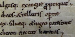
Constantinus Africanus, Liber Pantegni, 11th century, parchment, The Hague, Royal Library, MS 73 J 6
Parchment
For much of the Middle Ages dead cows were the main ingredient for books. What was frolicking in the meadow one month, may have been a page in a Bible the next. The skin of animals (calves, goats, sheep) was turned into parchment, which was subsequently cut into sheets. Parchment was introduced in late antiquity, when the codex (a book made of double leaves), was born and started to replace the papyrus scroll.
There is a lot you can tell from medieval skin. Like a physician today, the book historian can make a diagnosis by observing it carefully. The quality of parchment sheets varied considerably. Like people today, not all medieval creatures had perfect skin. Some cows loved to rub against trees while others were particularly prone to insect bites. We can still see these defects today, which appear as tiny holes, gaps or dark patches as we read Saint Jerome or Chaucer.
Perfect Skin
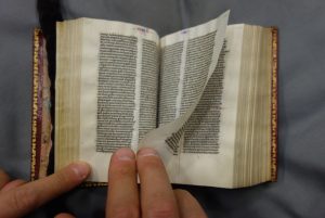
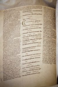
An example of high-quality parchment. Paris Bible, The Hague, Royal Library, MS 132 F 21, mid 13th century
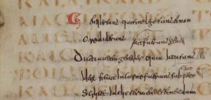
The quality of the page also had a lot to do with preparation. A scribe producing a book for his own library may be less attentive than one that worked in a monastic community. The best sheets have a deep-white color, with a hint of yellow. They feel like velvet and make a slight rustling sound when you turn the page—suspenseful whispers that teased the reader (image above). Bad skin, by contrast, crackles. It is of uneven thickness, and shows staining and a variety of colors (image below). Unlike what you may have thought, looking at imperfect skin is far more interesting than studying its perfect counterpart. This is because a defect tells a powerful story, shedding light on the book’s production and providing clues about its use and storage post-production.
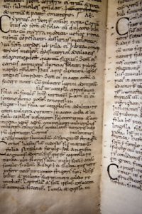
Detail showing hair follicles, the uneven edge of the animal skin and uneven coloring on the parchment from a book likely used in monastic education: Boethius, De institutione arithmetica, The Hague, Royal Library, MS 78 E 59, c. 1100
Damaged Goods: Holes and Rips
[LEFT]: A cut, accidentally left there by the medieval parchment maker when he scraped the hairs off the processed skin. The hole contains some white hairs from the cow who “donated” his skin for the production of this book. Leiden, University Library, BUR MS Q 1, c. 1100, photo: Erik Kwakkel
[RIGHT]: “Through-view” of an animal head initial. Eastern France, the first third of the ninth century (Bamberg, Staatsbibliothek, Msc.Nat. MS 1, fol. 25v and 26v).
Medieval craftsmen were well aware of the varying quality of animal skins, which they used as the basis for their books. However, calves, sheep or goats that had given up their livelihood and skin for the sake of medieval readers were not always to blame—and neither were the scribes. The most common imperfections are holes produced by the knife of the parchment maker.
Preparing parchment was a delicate business. In order to clear the skin of flesh and hair, it was attached to a wooden frame, tight like a drum. If the round knife of the parchment maker (the lunellum) cut too deep during this scraping process, elongated rips or holes would appear. A small puncture easily became a gaping hole. The art of preparing animal skin was to apply just the right amount of pressure.
However, readers did not seem to mind the holes too much and scribes usually just wrote around them, or they repaired them. Sometimes the reader is given an unexpected sneak peek onto the next page—where a dragon may just be introduced into the story (as in the image above).
A tear repaired through sewing, leaving a “snake” pattern across the page. Leiden, University Library, BPL MS 25, 11th century
The jabs of parchment makers—and the resulting holes—were sometimes stitched together. The image above shows a former rip (a long one) snaking across the page: the scribe has stitched it up like a patient in post-op.
A hole in the page is filled with embroidery by the nuns who owned the manuscript. Uppsala, University Library, Shelfmark unknown (14th century) / archive.org
Repairing holes was sometimes done more elegantly. In the manuscript above, the hole is not made to disappear, but it is highlighted by colored threads. In some monastic communities this must have been common practice, given that they repaired a lot of books with such “embroidery.” The practice turned defect into art: good-looking bad skin.
Hair Follicles
A follicle pattern with such pronounced “dots” that the scribe felt compelled to write around them. Leiden, University Library, BPL MS 191 A, 12th century, photo: Erik Kwakkel
Another skin problem encountered by scribes during a book’s production was the animal’s hair follicle—the skin organ that produces hair (seen above). These follicles show as pronounced black dots on the white page. Often parchment makers or scribes were able to sand them away, producing the desired smooth and cream-colored surface. However, if the follicles had been too deep in a calf or sheep, no dermatologist could have removed the imperfection, let alone the blunt instruments of the scribe. The only thing to do was to write around the patch. The follicles are helpful because they allow us to determine— from the distance between them—whether the animal was a calf, a sheep or a goat. This, in turn, may shed light on where the manuscript was produced: the use of goat, for example, often points to Italy.
The Transition to Paper
In the 12th century another material appeared in Europe: paper. Imported from Arabic culture, it was first exclusively used for documentary purposes, such as account books and letters. In a remarkable shift of scribal practices, in the fourteenth century scribes all over Europe started to use paper for manuscripts. Conservative scribes, such as monks, ignored the new material for some time, while others—especially those who wanted to economize—embraced it. Paper and parchment were used for all sorts of manuscripts, from chunky volumes to small portable books.
Skins and Scraps
Leftovers (Schedulae)
Tiny slip of parchment, likely made from scrap material, inserted to add notes to the text,Schedula, Leiden, University Library, BPL MS 139, 15th century, photo: Giulio Menna
When the scribe cut sheets out of the animal hide, he would normally use the best part of the skin—what may be called the “prime cut.” This meant staying clear of the very edge of the skin because these areas were very thin and translucent, and deemed unsuitable for books. The scribe therefore cut a rim of parchment from the edge of the skin. It usually came off in tiny bits and pieces, which he called schedulae—strips. These odds and ends were thrown in the bin. Sometimes they were taken out to be used as scraps, for example for taking notes in the classroom or for smaller pages inserted into existing manuscripts (see image above). These tiny pages supplemented the text or added notes, like our yellow sticky notes today.
Layers (Palmipsest)
An example of a palimpsest, Codex Guelferbytanus A, Wolfenbüttel, Herzog August Bibliothek, MS Lc 1, 6-13, fol. 90v, 6th century (lower text)
What to do when you run out of parchment as a medieval scribe? You can look around for something else to write on, such as left-over parchment strips in the bin (schedulae), or use paper, if it is available. Alternatively, you can take a book that is no longer used from your monastery’s library and scrape the text off its pages. You then simply apply text of your own. Such recycling resulted in a “palimpsest,” which holds a removed “lower text” and a newer “upper text.” The ink of the reapplied text often does not stick to the page very well, as is clearly seen in the image. Moreover, the older reading often shines through. Especially important are palimpsests from the earlier Middle Ages, because underneath this old text an even older work is buried, like a stowaway. With digital photography the lower text can sometimes be made visible again, which makes studying these books like digging for treasure.
Post-Production
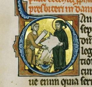
Scribe purchasing parchment, Hamburg Bible, 1255 (Copenhagen, Royal Library. MS 4, 2o) f. 183v.
Bad skin may also tell us something about the individuals who owned, read and stored manuscripts. The presence of holes and rips may for example indicate the cost of the materials. Studies suggest that parchment was sold in four different grades, which implies that sheets with and without visible deficiencies may have been sold at different rates. If this was indeed the case, an abundance of elongated holes in a manuscript may just point at an attempt to economize on the cost of the writing support. In other words, bad skin may have come at a good price.
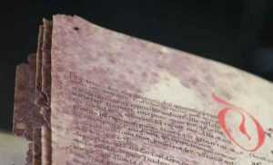
Parchment provides other information about readers as well, for example that he or she stored a book in an unsuitable location. Damp places, for one, would leave a mark on the manuscript’s skin, as is clearly seen in a manuscript I sometimes call the “Moldy Psalter”—for moldy it is.
Mold has attacked these pages and turned them purple, in an almost beautiful way. Leiden, University Library, BPL MS 2896, 12th century, photo: Erik Kwakkel
On nearly every page the top corner shows a purple rash from the mold that once attacked the skin. It is currently safe and the mold is gone, but the purple stains show just how dangerously close the book came to destruction—some corners have actually been eaten away. Similarly, if a book was stored without the proper pressure produced by a closed binding, for example because the clasp was missing, the parchment would buckle and produce “waves” on the page.
Apart from such attacks by mother nature, a manuscript could also be scarred for life by the hand of men—those evil users of books. Well known are cases where scribes and readers erased text with a knife, either because the reading was wrong or because they disagreed with it. However, in the wrong hands a knife could easily have a more severe impact on the book’s skin. All those shiny letters on the medieval page were too much for some beholders. The individual that gazed at the golden letters in the manuscript shown below used his knife to remove some of them.
The golden letters in this manuscript were stolen by a thief in the past, who cut them out with a knife. Leiden, University Library, BPL MS 59, 14th century, photo: Erik Kwakkel
While the velvety softness of perfect skin can be quite appealing to handle, getting to know imperfect parchment is ultimately more interesting and rewarding. Damage is telling, and it may shed light on such things as the attitude of scribes (who did not necessarily mind holes on the page), the manner in which a book was stored by its owner (with a missing clasp or in a wet environment), and even the state of mind of those looking at it (“Must cut out golden letters!”). As a book historian it feels good to work with bad skin.
An Introduction to Medieval Scripts
Can you tell the difference between Carolingian Minuscule and Gothic script? Watch this video and you’ll learn how. A conversation with Dr. Erik Kwakkel and Dr. Beth Harris about medieval scripts at the National Library of the Netherlands, in The Hague.
The Work of the Scribe
Into a letter P: St Paul at the desk with ruled quire, writing, Hamburg Bible, 1255, Denmark, The Royal Library, MS GKS 4 2°, vol. III, f. 125r
Get Set!
Before a single word flowed from his pen, the scribe needed to prepare the page. Whether he had opted for parchment or paper, the sheets were completely blank to start with. So, he first needed to think about a sensible layout, carefully considering his options. Did the text he was about to copy carry certain conventions? Was it, for example, a book that was to contain glosses (notes), or was it made for portable use? Preparing the page was a labor-intensive process, especially when the scribe had opted for a complex layout, with multiple columns and glosses. It was important to get it right since a messy layout would produce a messy book.
Prickings at the parchment edge used to create a ruled page. Boethius, De institutione arithmetica, c. 1100, The Hague, Royal Library, MS 78 E 59
Rules
Unlike our notebooks today, medieval paper and parchment sheets did not come with ruled lines when you purchased them. A medieval page consisted of both horizontal and vertical ruling. To add these guiding lines to the blank page, the scribe would prick tiny holes in the outer margins, as well as in the upper and lower ones. Lines were then drawn between these holes, usually with the help of a ruler: horizontal lines to guide the space between each line of text, and vertical lines to confine the left and right side of the textblock.
Blind rules created with a hard point (detail), Statius, Thebais, The Hague, Royal Library, MS 128 A 38, c. 1100
Until the early twelfth century the ruling was done by pressing down on the parchment with a sharp object (a “hard point”), producing a “gutter” that would guide the scribe’s pen. In the twelfth century this type of ruling was replaced by drawing lines with a pencil (called a “plummet”), which left more visible traces on the surface of the page. From the thirteenth century a pen was used as well. Because of all these horizontal and vertical lines, if a layout was very complex, the ruling pattern may appear as a true cobweb.
Puzzles
Leiden, University Library, VLQ MS 104, Glossed Bible, photo: Giulio Menna
How a page was designed depended on a variety of factors, including the number of required text columns, the space left blank for decoration, and the presence of marginal glosses and running titles. The most basic layout consisted of a single column of text. They are frequently encountered in Books of Hours (books made for use in private devotion), because these are commonly smaller books, which facilitated portability. Bigger books of two or more columns often required more work in the design stage, especially if that book also featured a marginal commentary. Particularly challenging were those cases where the commentary was of unequal length. This meant that the scribe had to design each page separately. Piecing together the segments of main text and commentary (see image) was like solving a puzzle.
Location, Location, Location
Quire consisting of 5 bifolia—source: Fitzwilliam Museum
As with our modern books, medieval manuscripts consist ofquires, small packages of folded leaves. Scribes often produced the quires themselves, but it also appears that they used prefabricated quires bought in a shop. The scribe would copy the text onto the pages of the quire, which would later be bound together to form the completed manuscript. To make sure that each finished quire ended up in the correct order, the scribe often wrote the first words of the next quire in the lower margin of the last page he copied. These are called “catchwords.”
A dog decorating a catchword at the bottom of a medieval page, Oxford, Bodleian Library, Canon. Misc. MS 110, fol. 17v, c. 1400
If the catchword at the end of the quire matched the first word on the next quire, then they were in the correct sequence. To help binders put the quires in the right order, scribes would also number them. In the later Middle Ages, further organization was added to the page by also numbering the individual bifolia, so as to keep track of their specific location within the quire. In spite of all this emphasis on location, from time to time binders still jumbled up the sequence.
Leiden, University Library, VLQ MS 1, 11th century, photo: Giulio Menna
Bundling Sheets
Quires are usually made from bifolia (singular: bifolium) or double-sheets of parchment or paper. To create a bifolium, a sheet is folded in half (each half is called a “folium,” which consists of two pages, i.e. the front and back of the folium). If the quire is the building block of the medieval book, the bifolium is what defines the quire: four, five or six of them were bundled up and subsequently filled with text.
Looking closely at the binding of the book, each bifolium appears to embrace its neighbor, bonding together to produce a strong quire. Before roughly 1200, bifolia were usually cut from processed animal skins, each of which usually supplied usually one to four double-sheets. They were either cut from the skin, or the skin was simply folded, either once (folio), twice (quarto), or three times (octavo). Paper double-sheets were exclusively produced by folding the full sheet.
Irregularities
Quires bound together, Irenaeus of Lyons, Leiden, University Library, MS VLF 33, 1300-1350, photo: Giulio Menna
Quires form the building blocks of the manuscript. How many bifolia the scribe bundled together often depended on his or her location. Book producers in England, for example, are known to have regularly produced quires of six bifolia, while scribes on the continent typically preferred quires of four bifolia. Some quires are irregular. An extra folium could be added (called a singleton) or a leaf could be cut out. Such instances of irregularity are of great interest to book historians, because they may suggest that the original composition was expanded by the scribe (for which an extra folium was needed) or because a blank folium was removed at a later stage, for example because it came in handy for taking notes.
Words, Words, Words: Medieval Handwriting
Jean le Tavernier, Portrait of Jean Miélot in his workshop, after 1456, Miracles de Notre Dame, Paris, Bibliothèque nationale de France, MS fr. 9198
The Hard Work of the Scribe
“The fingers write, but the whole body suffers,” (medieval saying)
Parchment makers prepared skins, scribes cut their pens and filled their ink pots, and binders packed their workshops with leather and wood. All these activities would be in vain were it not for the single event that sparked them: copying words.
Writing a medieval text with a quill is hard work. The pen could only make a more or less downward movement because of how the nib was cut. It meant that letters had to be broken up into multiple pen strokes. This made writing a very slow process: a Bible could easily take a year to complete. A scribe’s handwriting—script—can tell us where and when he was trained to write. Script tells us these things because the shape of letters was constantly changing—script is thus an important historical tool that helps to place stories and information into their proper cultural-historical setting.
What You Can Learn from Medieval Script
Medieval script—the handwriting of the scribe—is the material representation of a text. An author may have composed the text, producing the original thought, poem or story, but it was often the scribe who put these words on the page. Much rides on how he did this. If he was inexperienced, it may be difficult to decipher his writing. If he was sloppy, the wrong words may appear on the page, or the right ones in the wrong order. The handwriting of scribes varied considerably. Not only did individual scribes vary their individual letter forms, as we still do today, but style of medieval script often depended on when and where it was written. This makes script extremely useful for book historians: the producer of a manuscript may tell us, between the lines, where and when he made the book. “My maker is from Germany,” a letter or abbreviation may for example say. From time to time scribes would even say so explicitly, in a colophon at the end of the book.
The Main Book Script of the Middle Ages: Caroline Miniscule
Carolingian script (detail), Liberatus of Carthage, The Hague, Royal Library, MS 75 B 24, fol. 4r, 10th century
Caroline Minuscule is the primary script of the early Middle Ages. Created in the late eighth century, it became the main book script in the empire of Charlemagne. It is an elegant script with a particularly round and spacious appearance Because Charlemagne had conquered a vast amount of territory during his reign, he found himself with an empire of many cultures, each with its own style of handwriting. A cohesive and unifying script was needed if his administration was to function properly. Caroline Minuscule looks familiar to our modern eyes because producers of typeface working for early Italian printers used it as a model. In fact, the ubiquitous default font “Times Roman” on our computers is also based on Caroline Minuscule.
The Transition to Gothic Script
A transitional script, where some letters retain the form of the Caroline Minuscule, and some begin to show features of Gothic script. Statius, Thebais, The Hague, Royal Library, MS 128 A 38, c. 1100
From the middle of the eleventh century Caroline Minuscule, the dominant book script at that time, started to include new letter forms. By 1100 the number of letter transformations had grown to such an extent that the script looked different from Caroline. Slowly the script evolved into what may be regarded as the second major book script of the Middle Ages: Gothic (used from c. 1225). Where Caroline was a unifying script, the transitional script of “The Long Twelfth Century” (1075-1225) divided Europe in distinct regions. Scribes in Europe adopted the new, hybrid writing form at different speeds, while they also varied the actual appearance of certain letter forms. Scribes in Germany, for example, were far more conservative than their peers in France and England.
Cursive vs. Book Script
Leiden, University Library, LTK MS 576, 15th century, photo: Giulio Menna
Books written between 1250 and 1600 were copied in a variety of Gothic scripts, some of which sport very different features. On the one side of the spectrum, there are formal book hands, presenting upright letters that appear to stand at attention. On the other side there are more casual cursive scripts, which were written with a thinner pen and featured connecting loops. By the early fifteenth century these two script forms were equally popular, although cursive script was introduced much later in book production. The introduction of cursive script is part of a broadening palette of scripts. This expansion may have resulted from the commercialization of book production—a consequence of the increasing demands of readers who purchased their books in small urban shops.
Cursive script began its career in the world of administration. Here it was used for account books, charters and other administrative texts. The clerks who produced these documents used a much thinner pen than what was used for formal book script. The flexible tip allowed for a faster pace and it gave the script a kind of “casual” feel.
While book script required the pen to be lifted between each stroke that formed the letter, with cursive script the pen remained on the surface of the page, with each letter connected by a ligature (or loop). Around 1300 this administrative script was exported to the world of book production. Students and scholars were early adopters, as were individuals involved in administrative duties, such as clerks, notaries and merchants. Civic clerks, for example, are known to have produced literary manuscripts after-hours, in part for an urban clientele who paid for their services. These professional users encouraged the migration of the script beyond its initial administrative setting.
A Medieval Textbook
Dr. Erik Kwakkel and Dr. Beth Harris look at a medieval textbook: Boethius, De institutione arithmetica, c. 1100 (National Library of the Netherlands, The Hague, MS 78 E 59).
Making Books for Profit in Medieval Times
While one may be inclined to emphasize how “foreign” the medieval book is—they are, after all, made of dead cows, and are handwritten—they present such recognizably modern features as a justified text, footnotes, running titles and page numbers.
Leaf (page) number in Paris Bible, London, British Library, Arundel MS 311, fol. 240, 13th century
Visiting a Bookseller
The similarities run much further than mere physical traits, however. Take for example the manner in which the book was made and acquired from the 13th century onwards. If you wanted a book in the later Middle Ages you went to a store, as in our modern day. However, the bookseller did not normally have any books in stock—except for perhaps some second-hand copies. You would tell him what you wanted, both content-wise and with respect to the object’s material features. You could specify, for example, that he use paper (instead of parchment), cursive script (and not book script) and add miniatures (or forego decoration). Just like so many other objects you bought in late-medieval society, the commercially-made manuscript was custom-tailored to the individual who purchased it.
The professionals who made books for profit were usually found near the biggest church in town. This was a well-chosen spot as canons and clerics (i.e. people who visited the church and who could read) formed an important part of the clientele. By the 14th century true communities of the book had formed in the neighborhoods around churches and cathedrals. Evidence from such cities as Antwerp, Bruges, Brussels, London and Paris suggests that in these communities a diverse group of artisans interacted with clients and with each other. It was a world bound not only by the book, however, but also by profit.
Marketing
Whether you were scribe, illuminator or binder, as a professional you would strive for quality and diversity as this ensured bread and butter on the table. In parallel to our modern book business, medieval manuscript artisans used various marketing strategies to attract new clientele. The most striking of these is advertisements. Scribes hung large sheets outside their doors to show what kind of scripts they had mastered. The short writing samples found on these sheets were often accompanied by the names of the scripts, which shows just how professional the world of the book had become. A particularly rich specimen survives from the shop of Herman Strepel, a professional scribe in Münster (c. 1447). In the true spirit of medieval marketing he wrote the names of all the scripts in golden letters on his advertisement sheet.
Advertisement sheet from Herman Strepel, professional scribe in Münster, The Hague, Royal Library, 76 D MS 45, c. 1447
Scribes also included advertisements in books they had copied for a client. An example of such “spam” is found in a French manuscript made in Paris by a scribe who calls himself Herneis. On the last page of the book he writes, “If someone else would like such a handsome book, come and look me up in Paris, across the Notre Dame cathedral.” Herneis and his fellow bookmen lived and worked in the Rue Neuve Notre Dame, which served as the center of commercially-made vernacular books. Similarly, students were served in the Rue St Jacques, on the Left Bank, where the latest Latin textbooks were on offer. For Parisians and students it was handy to have all the professionals in one street: you knew where to go when you needed a book and it was easy to check out who was available for making one for you.
Advertisement by Herneis le Romanceur, professional scribe in Paris. Giessen, Universitätsbibliothek, MS 945, 13th century
Book Streets
This centralization was equally convenient, however, for the artisans themselves. Booksellers (also called stationers) in Rue Neuve Notre Dame and in other such “book streets” in European cities depended on the professional scribes, illuminators and binders that lived in their vicinity. They would hire them for various projects. When a client came to order a book from a stationer, the latter would divide the work among the artisans he usually worked with. One copied the text, another drew the images, and a third bound the book. These hired hands were given contracts which specified precisely what they would have to do and how much money they received for it. From time to time the stationer would come and check on the progress they made. In some manuscripts these cost estimates were scribbled in the margin. Although making books for profit was a common scenario in the later Middle Ages, it did not make you particularly rich. On the last page of a Middle Dutch chronicle a clearly frustrated scribe wrote, “For so little money I never want to produce a book ever again!”
Marginal note in pencil regarding payment to the professional scribe Jehan de Sanlis, “ci (com)me(n)ce Jeha(n) de Sanlis a ratable VI d. a la piece” (Jehan de Sanlis made this for 6 pence per quire), The Hague, Royal Library, MS 71 A 24, 13th century
The Printing Press and the Demise of the Manuscript
The world of professional medieval scribes was shaken up by the coming of Gutenberg’s printing press around the middle of the 15th century. The ink pots dried up and the handwritten book slowly turned into an archaic object that was more costly than its printed counterpart. In the 16th century only large choir books (which did not fit on the press) and handsome presentation copies, custom-made for an affluent client, were still written by hand.
And so we see scribes jumping the handwritten ship, many ending up working in printing shops. Here, too, a striking parallel between the medieval and modern world of the book may be pointed out. Medieval producers and salesmen of books had to adapt to the new medium made popular by Johannes Gutenberg, just as publishers today have to change their ways in a world where pixels are gaining ground over ink.
Decorating the Book
Dazzling
Some medieval readers preferred pretty pictures and shiny decoration in their books. Not only did the sparkling page appeal to them, it also proved their economic status, or that the gift they gave was special. Undecorated books were also expensive, but decorated copies cost a true fortune, especially if gold was used. In a process called gilding, the decorator would apply an ultra-thin film of flattened gold to the page, which looked not unlike our modern tin foil.
Gilding, Leiden, University Library, VLQ MS 4, 14th century, photo: Giulio Menna
This page shows that the golden shapes were not appended directly to the surface of the parchment, but that they were stretched over little “hills” of plaster (note how the orange primer is shining through). This way the gold would catch the light from different angles, maximizing its dazzling effect.
Colorful Books
Decorated initial, Leiden, University Library, VLQ MS 38, 12th century, photo: Giulio Menna
When the quires were filled with text, the rubrics (title or chapter heading, often in red) were in place, and the scribe had corrected his work, it was time for the finishing touches. Many medieval books contain some kind of decoration in addition to the written words, usually executed by a different artisan. There is a considerable variation in style and quality of decoration, and, consequently, in cost. At the lower end of the scale is penwork flourishing, red and blue lines drawn with the pen in various patterns and shapes. Some of these typify local styles, allowing us to tie a manuscript to a specific country, city or religious house. At the higher end of the scale is illumination: often sophisticated little paintings that included color and often gold. While decorated books stand out among their other cousins, on the whole they were not very common.
Historiated initial, Leiden, University Library, BPL MS 14 D, 13th century
One-Letter Stories
Normally, letters work together to form words that present a story. From time to time, however, we encounter a letter that contains a narrative all by itself. This giant P initiates the name Paulus (Paul), who was the author of the following Bible text. To mark the beginning of the text the decorator extended the P and applied color and gold to it, turning the letter into a visual aid. Contained in the letter is St Paul himself, presented as the soldier of Christ. In his hand there is a large sword, his standard attribute in medieval decoration, and his head is clearly bald, which also aided in his identification.
While in this case the intentions of the decorator are clear, the meaning of some such historiated initials can only be understood by reading the story they initiate. Miniatures contained even more extensive narratives.
Leiden, University Library, VLQ MS 4
Penwork
In medieval times, penwork flourishing was the quickest and easiest way to add some color to the page. This style of decoration typically involves thin lines, usually in red and blue, drawn with a pen rather than a brush. The swirly lines form lively patterns with unexpected twists and turns, creating miniature mazes in which your eye gets lost easily. If you look carefully you may recognize familiar objects: a tree, the moon, pearls, a smiling face. The central figure attracting all of this artistic attention is the capital letter that needed decorating, in this case the letter “M” (for “Marcus”). The penwork decoration supported an important function of this letter, navigating the reader to the beginning of a new section of text. The specific flourishing patterns can often be pinpointed to a certain city or region, which turns these happy lines into a useful tool for the book historian.
Medieval Supermodels
Initial letter T, Gregorius Bock, Medieval Scribal Pattern Book, 1510-1517, Yale, Beinecke Library, MS 439, fol. 48r
This essay is devoted to a particularly attractive and rare kind of medieval manuscript: the model book. A feast to the eye, the object is filled with drawings and paintings that were meant to show scribes and illuminators how to decorate letters, paint initials, or add large segments of decoration to the page. Within this tradition, two types of model books can roughly be distinguished. Some functioned as instruction manuals. In these books, the drawings might be accompanied by a narrative or explanation that instructs the artisan how to proceed, usually in a step-by-step process. Other model books appear to have merely functioned as a source of inspiration: they present a wide array of shapes and drawings from which the artisan could take his pick.
The level of sophistication among surviving model books varies considerably. On the lower end of the spectrum there are pattern books that merely show how to make enlarged letters with some minor flourishing. On the higher end, by contrast, there are copies with high-quality stand-alone designs and sophisticated historiated initials inhabited by figures and scenes. Evidently the requirements of the artisans varied; and by proxy, so did the taste of medieval readers. It is this variation that makes model books so fascinating, both as physical objects and as cultural artifacts.
Plainly Decorated Letters
Gregorius Bock, Medieval Scribal Pattern Book, 1510-1517, Yale, Beinecke Library, MS 439, fols. 30v-31r
To start at the lower end of the spectrum, some model books merely showed scribes how to execute a certain script or how to draw plain enlarged capitals—the most basic kind of decoration. The book opening seen above is from Gregorius Bock’s Scribal Pattern Book, which provides instruction on both fronts (more about the manuscript here). Produced in 1510-1517, the first part of the small parchment book contains a series of alphabets in different scripts, some of which are clearly influenced by print typefaces. The second part contains decorative initials arranged in alphabetical order. In the introduction to his manual, Gregorius adds a dedication to his cousin Heinrich Lercher Wyss of Stuttgart, who was scribe to the Duke of Württemberg. The arrangement of the material shows how Heinrich likely used the book: he would thumb through its pages until he had reached either an alphabet or capital letter to his liking.
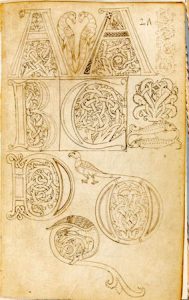
Model book (probably made in Florence), Cambridge, Fitzwilliam Museum, MS 83-1972, c. 1150-1175, fol. 1r
While Bock’s letters are a pleasure to look at, especially for the book historian, his designs are not exactly rocket science. More complex—but still relatively plain—are the models provided by a much older pattern book in the Fitzwilliam Museum in Cambridge. This appears to be the oldest surviving pattern book for initials: it dates from c. 1150 and was produced and used in a Tuscan workshop. The choice is much more limited than in the previous example: the Cambridge copy does not provide multiple alphabets, nor does it present a wide range of initials (in fact, only about twenty are present). Interestingly, some manuscripts survive in which we encounter decorated letters that could well be modeled from this or a similar model book (like British Library, Harley MS 7183).
Elaborately Decorated Letters
Letter K: from the “Macclesfield Alphabet Book,” 15th-16th century, London, British Library, Add. MS 88887, fol. 17r
On the more upscale end of things is the model book known as the Macclesfield Alphabet Book. It was made and used in fifteenth-century England, apparently for the transmission of ideas to decorators or their assistants. The artisans were offered quite a lot of choice, given that we encounter no less than fourteen different alphabets on its pages. What makes this book so special, however, is their quality and the manner in which the letters are designed: their shapes are produced by human figures in various uncomfortable positions—doing yoga exercises, it seems.
[LEFT]: Giovannino de Grassi, Alphabet Book, late 14th century, Bergamo, Biblioteca Civica, MS Cassaf. 1.21
[RIGHT]: Anonymous Lombard (workshop of Giovannino de’Grassi), Two studies of a cheetah, 1410, watercolor and bodycolor on vellum, 16.4 x 12.3 cm. © Trustees of the British Museum
A similar subject matter is encountered in the alphabet book of the Italian artist Giovannino de Grassi (above). This book was created at the Visconti court in Milan and features both initial letters and stand-alone drawings. The Visconti’s were important patrons of the arts and so it makes sense that we see their generosity extend into the world of book production.
Giovannino was known for depicting exotic animals in their natural habitat and this book features such images as well. His pages provided models for other artists who wished to replicate his realistic depictions (the image of the cheetah to the left is from his workshop).
Marginal Decoration
Göttingen Model Book, c. 1450, Göttingen, Universitätsbibliothek, Uffenb. MS 51 (left) and the same decoration executed in an actual book, a Gutenberg Bible (right)
Even more sophisticated are model books that show how to create elaborate decoration that runs in the margin along the length of the page. These border decorations, with their curly leaves and unexpected turns, could be tricky to produce. The so-called Göttingen Model Book, made around 1450, provides a solution to this problem. Its pages not only show, step by step, how to build a 3D leaf pattern, they also present detailed instructions like the following:
The foliage one shall first draw with a lead or a point. Then one shall outline the foliage with a pen and with very thin ink or with thin black color. Then one shall polish the foliage with a tooth, so that the color can be applied smoothly, but not too firmly. Then one shall paint it with the colors, one side right and the other side left or reversed, with a brush, namely light red and green. […] (source)
The drawings and narrative clearly complement one another. From time to time the instructions mention something like “as it is shown here” or “as the image shows.” A model book can hardly be clearer than this: while the alphabet books shown above were more or less meant to simply inspire the artist, the Göttingen book really takes the artist by the hand and guides him through each step of the production process. The instructions apparently worked well, as is shown by a surviving Gutenburg Bible that contains these very leafy borders (see above right).
The Final Point
Models are crucial in any learning process. Observing how something is done helps you acquire a skill you lack as much as it encourages you to develop further those you already have. Moreover, there is an additional use to these pattern books that has not yet been mentioned: patrons visiting artisans’ shops could well have been given these objects to find out what the book-maker was capable of providing. Given its many uses, it is hardly surprising that the tradition shown in this blog is also encountered in other cultures, including Byzantine and Arabic book production.
Outline drawings from a pattern book, Yale, Beinecke MS 553, 1400-1600
One particularly unusual Arabic specimen deserves to make the final point of this post. The fragment shown above presented Arabic decorators with models of scenes from the New Testament. It figures that the artisans, used to decorating the Qur’an, needed a little inspiration when it came to the Bible. This specimen is also interesting because some of the figures have been outlined by tiny holes, meaning that the sheet could be used as “tracing paper” (click the image to see this closer). While this ultimate instruction method took all potential flaws and creativity out of the modeling process, it allowed decorators with lesser talents to produce something beautiful.
Binding the Book
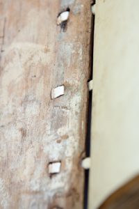
Wooden board of a late-medieval binding, Leiden, University Library, BPL MS 114, photo: Giulio Menna
Woodwork
Medieval manuscripts, even small ones, can be surprisingly heavy. Giant Bibles, large volumes that can stand half a meter tall, weigh as much as twenty-five kilos. It requires two library staff members to carry the object to your table. A fair part of this weight is produced by the boards of the bookbinding. To protect the stack of quires that made up the actual manuscript, a wooden board was placed on the front and back. The quires were then tied to thin leather straps, which were pushed through channels drilled through the boards. The straps were pegged into the wood, as seen in the image (note the white straps). It produced a surprisingly firm binding, which lasted for centuries. All this crafty woodwork is presently hidden from our eyes because the boards were subsequently covered with leather (which was often fitted with decoration). Thousands of pieces of medieval trees are presently hidden inside book bindings, like a shelved mini forest.
Wrapper
Parchment “limp binding,” Leiden, University Library, VLQ MS 1, 11th century (binding 17th? century), photo: Giulio Menna
The so-called “limp binding” is another type of binding that was in popular use in medieval times. Its most notable feature is the absence of boards, which explains its name. With a limp binding the quires are covered by a plain parchment wrapper without the support of wooden boards.The quires in these bindings—usually a limited number—are attached to the outer parchment with thin strings, which are visible on the outside. A limp binding resulted in a lighter manuscript, which meant it was easier to transport. This type of binding also decreased the cost, given that wood was not needed and that the binding process was less time-consuming. This is likely why this type of bookbinding was so popular among medieval students.
Accessories
Leiden, University Library, BPL MS 2778, photo: Giulio Menna
Many medieval books were a joy to look at even when they were closed. Various shiny “accessories” were drilled in and attached to the wooden boards on the outside of the book. The most pronounced of these are the so-called “bosses,” protective metal pieces attached to each corner of the binding. Much more common are clasps, pieces of metal that kept the book closed. These were needed because, unlike paper, parchment has a tendency to expand and buckle, which could push the book open. A clasp was therefore needed to keep the book closed when not in use, protecting the text inside. Also frequently added to the binding is decoration—flower motifs, playful line patterns, and at times even a painted scene. Such decorative elements on the outside of the binding became particularly common near the end of the Middle Ages.
Clasps: Hugging a Medieval Book
Leiden, University Library, BPL MS 2579, 15th century, photo: Erik Kwakkel
Book historians tend to compare features of the medieval book to body parts. Thus the manuscript’s “head” (top edge) is connected to its “spine” (the back) via the “shoulder” (the area where board meets spine). There are even terms that compare a medieval book’s physical features to human activities or conditions. A large letter with a lively figure inside is called a “gymnastic initial,” for example, while line ruling that is nearly invisible is “blind.” This article takes this projection phenomenon a step further. It shows how one particular feature of the medieval binding eerily resembles a body part, not just in appearance but even in function: the clasp.
Arm and Hand
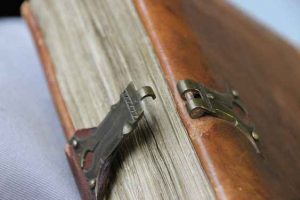
While a medieval book was produced to be opened and used, medieval makers of manuscripts paid just as much attention to closing it. In order to preserve the organic pages, which were often made of parchment, it was necessary to keep the volume tightly closed when it was not used. Not only did this keep moisture out, but parchment also has a natural tendency to buckle, especially when handled at room temperature. In fact, parchment pages curl up with so much force that the wooden boards would be pushed open were it not for a smart device designed to keep the lid on: the clasp.
Book clasp in shape of hand, 18th century (?), source—Daniel Crouch Rare Books
The clasp is like an arm that extends from the one wooden board to the other. Indeed, it is hard not to think of clasps as hugging arms that embrace the leaves, safeguarding them from the harsh reality of medieval book use. Appropriately, the primary purpose of clasps was to protect the pages. They generated the pressure needed to keep the pages flat, while producing a firm object that could withstand every-day use in a medieval library—like falling off a desk or a shelf. At the end of the arm a tiny “hand” locks into an extension, as clearly visible in the image above. How great that some book binders played with the image of a hand grabbing onto the opposite clasp, as this eighteenth century example shows (left).
Late medieval binding that has lost its clasps, Leiden, University Library, BPL MS 96 (14th century), photo: Erik Kwakkel
Generally, two clasps were able to contain the force issued by the buckling parchment of a book. However, it was important to get it right as a bookbinder. When the distance between the one end of the arm (the “arm pit”) and the handle bar was too large, there was insufficient pressure. By contrast, if the distance was too little, the book did not close. Medieval manuscripts that have lost their clasps (by far the majority) show what happens to the bookblock when the pressure was too low: unhappy pages with a wavy pattern appeared (above).
Exotic Arms
Some readers preferred exotic clasps. A particularly remarkable specimen is in the National Library of Sweden. The book it helps to close is tiny, no larger than an iPhone. Made c. 1500, it was designed for the road: it concerns a portable Book of Hours (or prayer book) that was carried around by a pilgrim on his religious pilgrimage. The clasp holding it closed is in fact a skull carved out of bone. The theme is fitting for a pilgrim seeking redemption, finding his way along the dusty roads of medieval Europe. Every time he sat down to open his book he was confronted with his future, which looked rather grim: Memento mori, remember that you will die one day. Better smarten up and keep on going!
The exoticness of clasps is sometimes connected to their number instead of their shape. Clasps are a must for a peculiar binding known as dos-à-dos (or “back-to-back”). While such bindings usually hold two books bound together at their backs (hence the name), the National Library of Sweden owns a unique variant that contains no less than six books. They are all devotional texts printed in Germany during the 1550s and 1570s (including Martin Luther, Der kleine Catechismus) and each one is closed with its own tiny clasp (see the various openings here). A book with six arms and hands: it is quite the display of craftsmanship.
The chained library in Zutphen, the Netherlands (De Librije), photo: Erik Kwakkel)
If clasps can be compared to arms, another feature of the bookbinding must be called “feet.” During the later Middle Ages it became customary to store manuscripts on lecterns. In lectern libraries, which were found in monastic houses and churches, readers consulted books on uncomfortable benches. The libraries often had a semi-public function, with outsiders walking in and out to consult books. To facilitate such use—and to make sure no books were unlawfully removed—the objects were usually chained to the lecterns (above).
Late medieval bookbinding with “feet,” Leiden, University Library, BUR MS Q 1, c. 1100, photo: Erik Kwakkel
Books in lectern libraries were not read on a flat surface (such as a desk), but erect – the objects were resting, after all, on nearly vertical stands. This kind of use came with a challenge: the shuffling that inevitably happened when the book was read, wore out the lower edge of the binding. More importantly, since the medieval book block was flush with the binding, the constant contact with the lectern as the reader flipped through the book could easily damage the page. A simple tool was invented to prevent such damage: “feet”—tiny pieces of brass that hoisted the book up and made it hover, as it were (above). The feet that are attached to bindings are often shiny. It shows just how much the book was used—and how much damage was prevented by the attached feet (see below).
Leiden, University Library, BPL MS 67, 9th century, photo: Erik Kwakkel
There is something very attractive about these body parts. They show just how much bookbinders and readers were in tune with the needs of the book as an object. They packaged them so that they could withstand rough consultation, while their designs also left room for a certain amount of fun—as the hand-clasp and perhaps even the skull-clasp shows. The hug given by these strong arms protected the book’s most precious cargo, the text, both from accidents in the medieval library and, as much as possible, from the inevitable decay of time.
Medieval Books in Leather (and Other Materials)
Every book needs a coat, a protective layer. Without it, after all, the pages would be exposed to the elements and the dirty hands of readers. And so from the very early days of the book the object was given a binding. Medieval bindings mostly consist of two components: boards, commonly made out of wood (but in the later Middle Ages also from compressed paper), and something to cover the boards with. While in medieval times the most common covering material was leather, there is great variation observed in the kind that was used, as well as how it was decorated. Readers and reading communities had their own preferences in this regard. As a result one can “read” as much from the outside of the book as from its pages: they both transmit important cultural-historical information. This is a essay with an exotic twist, which includes bindings made from seal and human skin.
London, British Library, Add. 89000, 7th century. The St Cuthbert Gospel (formerly known as the Stonyhurst Gospel) is the oldest intact European book—i.e.still in its original binding.
Wearing Leather
Most medieval bindings were made out of animal skin—usually it was a calf or pig who involuntarily ended up protecting the manuscript. Leather proved an ideal material for binding books. It is stiff, which means it does an excellent job protecting the precious cargo inside, while at the same time adding to the desired “firmness” of the book. The material also repels water quite well. This benefit may seem odd, but it’s not. While monks may not have been reading books in the bath tub, they did consult them in the cloister, which was often a damp environment—given that the hallways were in the open air.
An added bonus of leather was that it accommodated blind-tooled decoration, which was applied in mesmerizing shapes and patterns. The oldest book to survive with its original binding still in place is the seventh-century St Cuthbert Gospel (which is a Gospel of John, in fact, image above). It shows just how utterly charming early-medieval leather bindings were; and how beautifully they were decorated. The manuscript in question was placed in the coffin of St Cuthbert shortly after his death in 687. It was discovered when the grave was opened in the early twelfth century. By then a cult had grown around St Cuthbert, so the book and its original binding were both well taken care of. In fact, the binding looks like it was made yesterday.
Leather binding used for a papyrus book, London, British Library, Papyrus 1442, dating 716-717
The use of leather bindings predates books made out of parchment—like the book of St Cuthbert. Before parchment became common, books were made from plants—papyrus. Such papyrus codices were extremely fragile and they needed the protective qualities of leather, which may ultimately be the origins of the tradition of using skin for bindings. Given that papyrus not used after the fifth century (with some exceptions), very few original bindings of papyrus books survive. The oldest specimens we have are those in the so-called Nag Hammadi Archive, which date back to the third and fourth centuries. As you can see from the image to the left, these covers of papyrus books were also decorated handsomely.
Seal skin binding. Landsbókasafn Íslands, National and University Library of Iceland, GKS 2870 4to, Njáls saga, 1290-1310
What to do if you need a leather binding, but there are no cows or pigs to slaughter for this purpose? The answer is seen in the image above, which shows a book that was copied and bound in Iceland. Naturally the binder turned to creatures that were available there. This is how a poor seal ended up covering this Old Icelandic book with sermons, which was made around 1200. If you look carefully you can still see a significant amount of hair on the outside. As with other cases where animal hair is found on book covers, the hairs have turned green over time (or perhaps from the liquids involved in processing animal skin into leather).
But the skin used for bookbindings is not limited to animals. Under the name anthropdermic bibliopegy goes the practice of using human skin for binding books. It turns out to be a post-medieval practice, which was particularly popular in the 17th and 18th centuries. The cover seen here dates from the early 17th century and the skin was taken from the priest Father Henry Garnet. He was executed in 1606 for his role in the Gunpowder Plot—the attempt to ignite 36 barrels of gunpowder under the British Parliament. The book in question actually outlines the story of the plot and the evidence of Garnet’s guilt. The origins of the binding must have given the reader significant satisfaction.
The Last Word: Cloth
Not all medieval books were dressed up in leather. Less commonly used, perhaps because it is more fragile, is cloth. This material handled the frequent use of a book far less well than leather. The real-world use of a medieval book was such that the object would be pushed back and forth over a wooden desk, which did not exactly contribute to a long life. The cloth binding seen here dates from the middle of the fifteenth century and it covers a monastic rule.
The manuscript has a particularly pretty button to close the volume up, adding to the charm of this beautiful bookbinding. In the age of the printed book such cloth bindings became more common, perhaps because more books were privately owned. This meant, of course, that the objects were not consulted on the hard surface of a wooden desk, but on the soft lap of the reader. As with embroidered bindings, which also increased in popularity in post-medieval times, cloth may have been regarded as a more suitable material for private reading.
Making Manuscripts
An illuminated manuscript is a book written and decorated completely by hand. Such manuscripts were among the most precious objects in medieval and early Renaissance monasteries and courts. Discover how skilled artists and craftspeople created these beautiful illuminated masterpieces. Created by Getty Museum.


