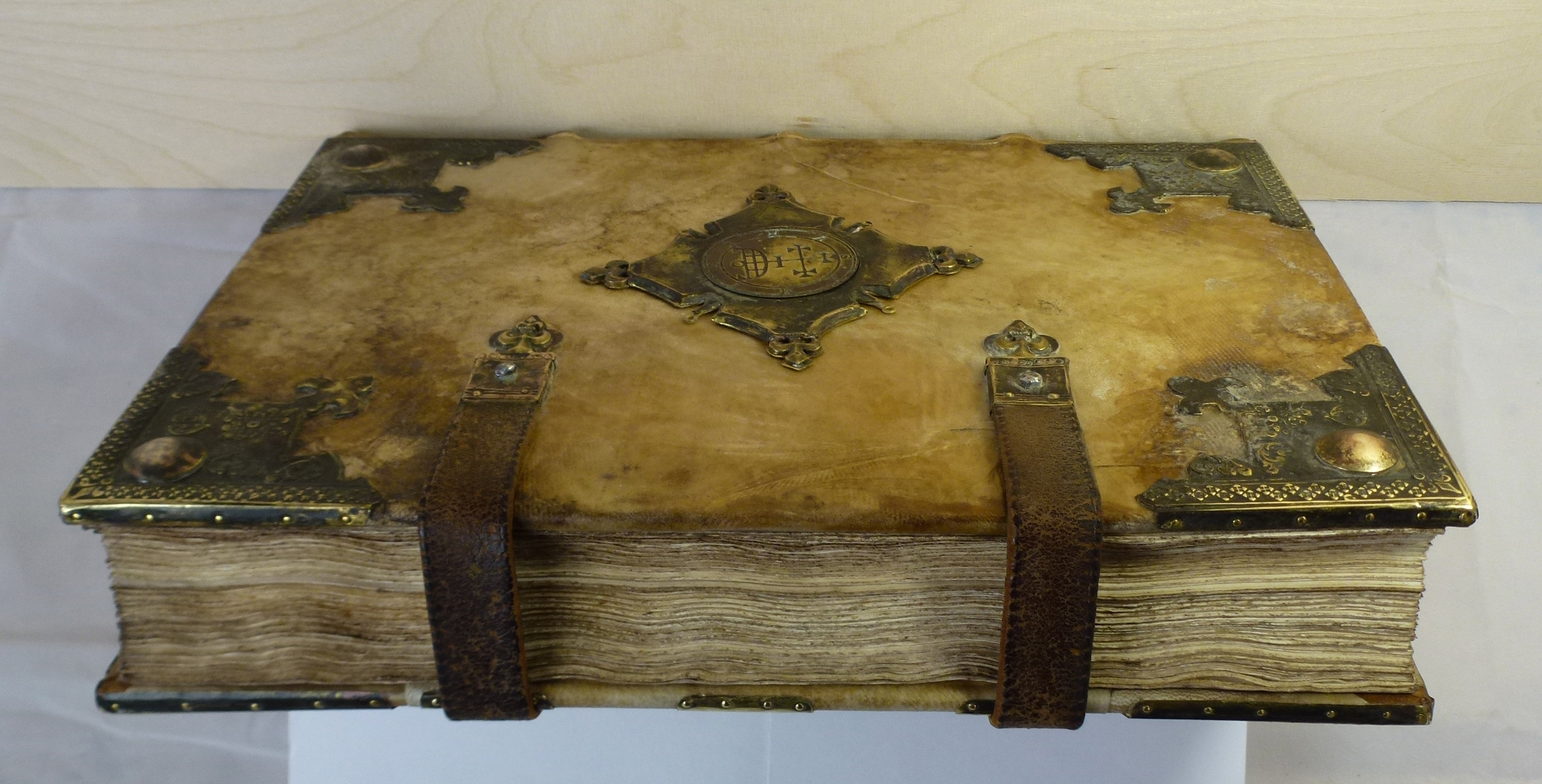
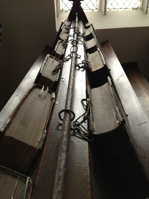
Medieval book model / Whetton & Grosch

By Dr. Eric Kwakkel / 12.08.2014
Professor of Medieval History
University of Leiden

Introduction
Up to around the year 1200, members of religious houses—monks and nuns—were the primary consumers of books. They produced the objects themselves and in high numbers, because religious houses could not function without them. The 13th century saw a sharp rise in the production and consumption of books outside the monasteries. Books were now also made for profit in urban shops, both for use by citizens, students and even monks.
Most medieval bookstores were empty because books were too expensive to have in stock. Instead, each customer would have a long talk with the shopkeeper, who would ask how much he wanted to spend, what materials he preferred, what kind of writing style should be used for the text—and so on. The medieval book is therefore always one of a kind. Users often modified the manuscript post-production, bringing it even more in tune with their needs. Bookmarks could be added for quick access to favorite chapters, while nota signs and maniculae placed in the margin marked important passages. Moreover, glosses and slips with notes were inserted where the text needed clarification.
Fossilized Taste (Bookmarks)
Bookmark glued to a page. Leiden, University Library, BPL MS 304, photo: Giulio Menna
The bookmark guided the reader to the beginning of a favorite chapter or a significant section of the book. Flowers or leaves, which were sometimes drawn into the manuscript, marked the page in the most elegant and practical manner. More permanent and secure, however, are bookmarks like the one seen here: a piece of parchment that was pasted onto the page.
What a great thought, that medieval fingers inserted these stubs to get to their literary fix! Some bookmarks are fragments of redundant manuscripts, from which they were cut as a form of recycling. The stubs are interesting to book historians because they show what texts of passages were enjoyed by individuals that lived hundreds of years ago. They are the fossilized remains of medieval literary taste.
Note to Self (Nota)
Leiden, University Library, VLQ MS 10, fol. 93r, photo: Giulio Menna
While the bookmark guided the reader to an important chapter or text, the nota-sign marked a significant passage or sentence on the page. From time to time readers noticed something in the text worth highlighting. In such cases they wrote the Latin “nota” in the margin, which means to “examine” or “inspect”. While some of these nota-signs may have served as a reminder to check something, others appear to express a more generic “attention!”—like the manicula did (see below).
As this example shows, the sign is not written like a normal word. Rather, its four letters are reshuffled and stretched so as to form a unique symbol. This was likely done to distinguish a reader’s passages from those marked by other users of the book, such as his fellow brethren in the monastery.
Helping Hands (Maniculae)
Manicula with the body of a dragon. Marginal Sketches, in A Volume Of Treatises On Natural Science, Philosophy, And Mathematic s, c. 1300, London, British Library, Royal MS 12 E.xxv, fol. 23r
With a nota-sign the reader expressed that a passage was noteworthy or deserved a closer read. The manicula (Latin for “little hand”) was another means to do so. As with nota-signs, the actual form of the pointing finger varies considerably. Readers may have had their own unique design to distinguish their hands from those of other readers. The hands are sometimes accompanied by short notes, which the reader may have written in response to the text. As with bookmarks and nota-signs, maniculae show us what information were deemed important or relevant to an individual long ago. In that sense they lend a helping hand to the book historian as much as they did to the medieval reader.

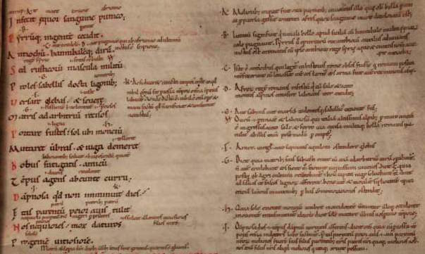
Marginal glosses with corrections next to the text, Leiden, University Library, VLQ MS 1, fol. 16r, photo: Giulio Menna
Add-On (Glosses)
From the moment we learn to read as a child we are told not to write in our books. Still, we often do, especially when we use the book for school. If it is not our own copy, we may write with pencil, so that our personal thoughts may be removed after use. Medieval readers had no problem writing in the margins, and apparently had no qualms about using permanent ink. In fact, it is hard to point out a manuscript that does not contain any such add-ons.
Some of these notes (or glosses) were extensive, and the scribe had to extend the margins to accommodate them. The glosses seen here provide an alternative meaning (mixta vel bibita), a clarification (posita) and an encouragement to check something out in another book (the letter “r” for “require”).
Sticky Note

Inserted slip with notes, Leiden, University Library, BPL MS 139, photo: Giulio Menna
More extensive notes were sometimes written on tiny paper or parchment slips like the one seen here. Students are known to have used them to take down notes in the classroom or when they were studying a text at home. Few of them survive today. Not only were they easy to lose, but many of them were actually thrown out, similar to the fate of our modern day “sticky notes.” In some manuscripts they survive because they were tucked in between the pages, as seen here.
The Medieval Desktop
Desktop (detail), Albrecht Dürer, Erasmus of Rotterdam, 1526, detail of an engraving, (The Metropolitan Museum of Art)
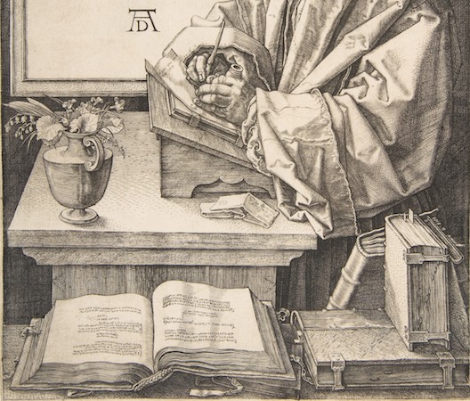
We are used to having multiple books open at the same time when looking things up at home or writing an essay for class. Whether PDFs, e-books or good-old-fashioned paper volumes, switching between books in a smooth movement is something we don’t often think about. This was very different in medieval times. In those days, books tended to resist when you tried to move them: they were as heavy as a brick and easily twice that size. A related problem was one of space. The average medieval book has a wingspan of at least half a meter wide when open. Consequently, comfortably placing two books in front of you was a stretch, let alone multiple volumes. In an early-sixteenth-century depiction of Erasmus, the scholar cannot even place a single book on his desk as he is writing a letter (above).
Interestingly, the challenges of medieval book consultation stands in stark contrast with what we know about reading and studying in the period. We know that readers were interested in learning different points of view with respect to their topic of inquiry, and so browsed through a great number of volumes at the same time. Sparked by this contradiction, this article explores medieval desktops. How many books are being consulted at the same time in medieval depictions of reading? How are the objects laid out across the available space? In short, how are we to understand the logistics behind the devouring of knowledge in the last four centuries of the Middle Ages? As will become clear, the answers to these questions vary greatly depending on why an individual handled multiple books at the same time.
Scribes
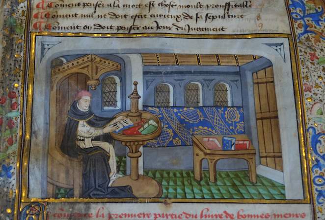
The first group of individuals who had to manage multiple books were scribes. By definition, a scribe had to have at least two books on his desk: the one he was making (a growing pile of quires, which remained unbound until the very end) and the one he was copying from (called the “exemplar”). While keeping track of the loose quires may have been challenging, of the groups discussed here scribes had it the easiest. After all, the individual was only technically reading one book—the one he was copying from. This explains why their deskspace was of limited size, at least judging from surviving depictions.

Jean Le Tavernier (illuminator), Jean Miélot in his study, after 1450, Buonaccorso of Pistoia, Brussels, Bibliothèque Royale, MS 9278-80, fol. 10r
In most cases their working space was erect rather than flat. The famous image of Jean Miélot at work (above) shows how the desktop of the scribe had a 45-degree angle, resulting in an almost erect surface. Clearly visible is also a vertical orientation in the line-up of the books: one was placed above the other. In fact, the desktop in this image is split in half, with the lower half containing the book under production, as well as the scribe’s tools (ink pots and pens), while the upper half holds the exemplar. Miélot obviously needed to go shopping for a larger desk, because we see books laying around on the ground and on a bench.

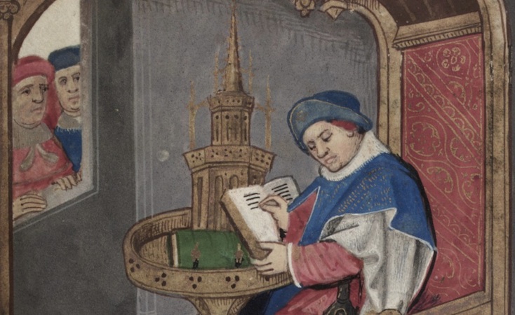
Miniature of the translator, Simon de Hesdin, at work in his study, Valerius Maximus, translated by Simon de Hesdin and Nicholas de Gonesse, Facta et dicta memorabilia, 1479, London, British Library, Royal MS 18 E. III, fol. 24r
Interestingly, there are also desks with a horizontal orientation. The image at the left shows the translator Simon de Hesdin at work. Although the books are out of sight, the desk clearly provides room for two books. However, they placed next to one another. This may be specially done for the task of a translator, who needed to carefully read the source text and subsequently scribbling down the translation in loose quires or on loose sheets. This way, both books would be right before him: there was no need to look up at a high book platform.
Readers
While it is easy to find images of scribes with a desk full of books, it is less common to encounter readers in similar situations. That is to say: there are very few medieval scenes in which someone is reading but not writing—where books are present but pens are not. In part, this has to do with medieval study practices. Readers would usually have a pen nearby even when they were just reading. After all, remarks and critiques needed to be added to the margin at the spur of the moment. “Penless” images, while rare, often show a crowded desktop. The image below shows Christine de Pisan (a late medieval author) browsing multiple books at a big desk.
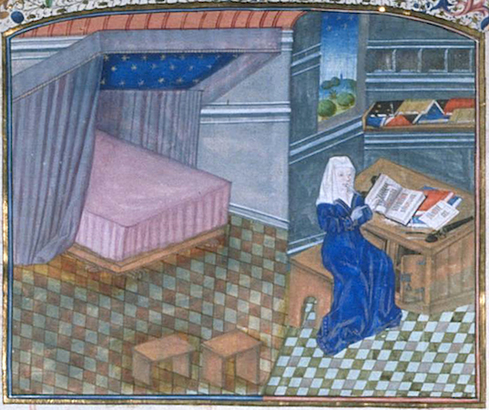
Christine de Pisan in her study. Brussels, Bibliothèque Royale, MS 9009-11
The absence of the pen may result from an urge to depict Christine as an avid reader. This is emphasized, I think, by the various volumes that lay open—note how some open books are facing down, the way we still do today! From the late medieval period a special tool was available for readers who did not like the clutter shown on Christine’s desk: the book carousel.
Roman de la Rose, probably 2nd half of 15th century, Oxford, Bodleian Library, Douce MS 195, fol. 1r
These carousels allowed readers to consult multiple manuscripts in a very convenient fashion, by spinning (slowly!) the top part, which moved. The oldest one I could find dates from the fourteenth century, but it is possible they were in use even earlier. It is striking that these two scenes (above and below) show readers—scholars—without pens, even though the second seems to hold an invisible one.
Leiden, Universiteitsbibliotheek, BPL Collection, photo: Erik Kwakkel
Book Hipster

Book wheel, Agostino Ramelli, Diverse et artificiose machine, [Leipzig] Durch Henning Grossen den Jüngern, 1620 (first published 1588), p. 440
Cleverly, the medieval “spinning wheels” circumvented the constrictions of the limited space a regular desktop provided. However, what if you need even more real estate than the turning desktop could offer? The answer to this question is perhaps one of the most intriguing pieces of book furniture that survive from the past: the book wheel.
The image at left shows the book wheel invented by the Renaissance engineer Agostino Ramelli, whose concept was based on medieval designs. The upside to the carousel is obvious: there was space for a lot of books. This practice is not unlike deciding to hook up a second monitor to your computer, except that the individual is actually watching twelve monitors at the same time—like a trader on Wall Street. I have sat behind one from the 17th century myself and it is truly a majestic feeling to spin the wheel. The click-click sound of the gears hidden inside the device is simply mesmerizing.
The Last Word: Latptop
A scribe identified as Priscian or Donatus, part of a series of Liberal Arts and scribes on the archivolt of the right bay, West Portal, Chartres, c.1150), photo: Holly Hayes
While desktops (in their great variety) are representative of how most scribes and readers handled their books, there is also a surface space that is more exceptional—and that can only be addressed as a “laptop.” The use of such portable desks, which sat on the scribe’s lap, is well documented for the early-modern period. They were used, for example, by noblemen or secretaries drafting documents and letters while on the road.
The portable desktop was generally a box with a slightly angled surface, inside which the writing materials were stored, including sheets, ink and pens. Interestingly, this practice—and tool—goes back to at least the twelfth century (see image, left). The device contained a hole for the ink pot and inside may well have been blank sheets—in parallel to the portable kits from the Renaissance.
Apart from the fact that the actual desk space was more limited than what we are used to, the medieval desktop was not so different from ours, including how messy it was. They contained books, both open and closed, as well as writing tools. However, more so than in our present time, desktops were a necessary tool, whether they were packed (as in Christine’s case) or with only one or two books in place (as with most scribes). The medieval quill, after all, needed a stable and even surface. While desktops may seem trivial objects to us, they were crucially important to both medieval scribes and readers.
Getting Personal in the Margins
Herbert of Boshom, Glossed Psalter, late 12th century, Cambridge, Trinity College, MS B.5.4, fol. 33v
At its very heart the medieval book is a vehicle of information. It was an expensive receptacle for text, which was poured onto the page by the scribe, and retrieved by the reader. As strange as this may sound, as a book historian I have limited interest in the actual text found on the medieval page. My job is to look at books, not to read them: knowing author, genre and purpose often suffices for what I do. Very different, however, is my attitude towards words found in the margins, placed there “extra-textually” by scribes and readers. Here we may find information about the production circumstances of a given manuscript and the attitude of scribes or readers towards a text. In most books, there was ample room to add such details, because on average a stunning fifty percent of the medieval page was left blank. It is in this vast emptiness—so often overlooked in editions of texts—that we may pick up key information about the long life of the book.
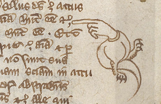
Pointing a Finger
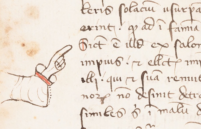
Isadore of Seville, Sententiae, Lawrence, University of Kansas, Kenneth Spencer Research Library, MS C54, fol. 96v
We are taught not to point, but in the margin of the page it is okay. Readers frequently felt the need to mark a certain passage, for example for future reference, or to debate its meaning. To do so, they added manicula (Latin for “little hand”)—those highly entertaining pointing fingers. This is good news for us, because they facilitate a look into the mind of a medieval reader. It is not uncommon that a person’s interest shines through the collection of marginal hands in a manuscript. While most individuals simply marked spots with an X, the pointing hand provided a much clearer—and more expressive—signpost.

Unusual manicule wih five spread fingers, Cicero, Paradoxa stoicorum, 14th century, Berkeley, Bancroft Library, BANC MS UCB 85, fol. 5v
A particularly entertaining pair is found in Berkeley’s Bancroft Library. To mark a particularly long passage we encounter a hand where all five fingers have been drafted into service, while in another case the hand is replaced by an octopus with five tentacles.
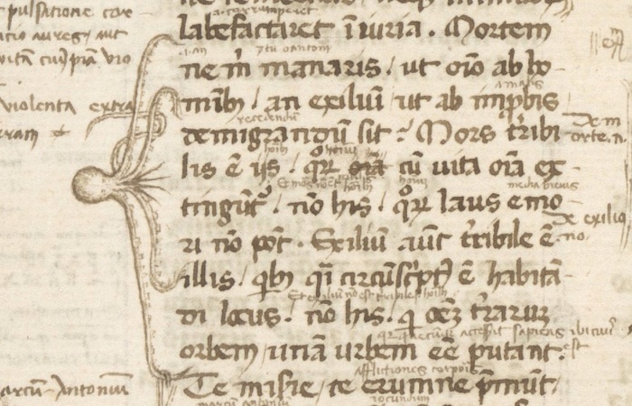
Marginal bracket in the shape of an octopus (with five legs), Cicero, Paradoxa stoicorum, 14th century, Berkeley, Bancroft Library, BANC MS UCB 85, fol. 1v
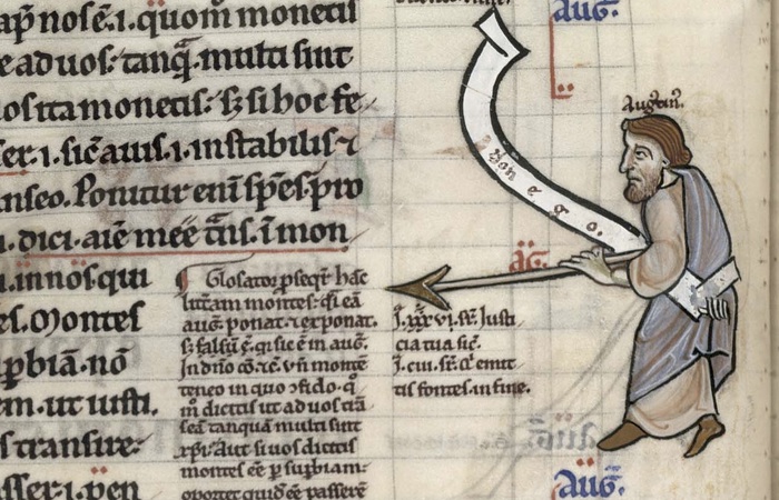
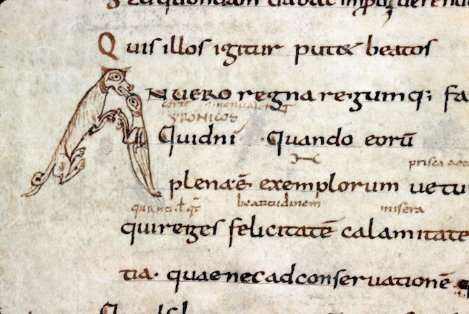
From time to time a debatable passage is highlighted by a pointing device that is part of the book’s decoration, like Augustine taking a stance while aiming his spear at a gloss in the text (image at the top of the page).
Critiquing Authorities
There is nothing more inviting to a critical mind than the empty space of the margin. Medieval readers frequently felt the need to vent in that location, for different reasons. Like Augustine and his spear—they would express their dismay about something. There is the Carthusian monk from Herne, for example, who could not handle the poor Latin-Dutch Bible translation he was reading. With a pen shaking from frustration he wrote: “Whoever translated these Gospels, did a very poor job!” (14th century, Vienna, Österreichische Nationalbibliothek, S.n. 12.857, fol. 95v).The same person is encountered in the margins of a different manuscript, where he corrected yet another flawed translation (Brussels, Bibliothèque Royale, MS 2849-51). Providing improved readings in the margins he added the following personal touch: “This is how I would have translated it.” Take that, translator!
Aristotle, Libri Naturalis, London, British Library, Harley MS 3487, f. 16v
While such explicit remarks are exceptional, critiquing the text in the margin was a normal thing to do as a medieval reader. In most cases he or she would jot down a gloss next to the actual text and connect the two with so-called tie marks—the precursor of our footnote (see the left margin in the image above). This practice became particularly popular in the university classroom of the thirteenth century. The De disciplina scholarum, a student guidebook from Paris, stipulated that wax tablets or tiny slips of parchment be taken into the classroom for note-taking. These notes were later added to the margins of students’ textbooks. Aristotle manuscripts—the main textbook for the Arts Faculty—even provided a clever “zoning” system to accommodate criticism: the margins were broken up into vertical columns where the opinions of master and student would settle (see image above).
Smart Bookmarks
Marking pages for future reading predates browsers and the web. In fact, the practice is much older even than printed books. This essay introduces various ways in which monks and other medieval readers kept track of the page at which they had stopped reading—and from which they planned to continue in the near future. What tools were available for this purpose? And how did these differ from one another? Apart from addressing these two queries, this post also reports on a genuine discovery: a new specimen of a rare but particularly smart type of bookmark, found at the University Library in Leiden. Cleverly, and unlike our modern equivalent, the bookmark in question showed medieval readers not only at what page they had stopped reading, but also in which text column and line they had left off.
Static Bookmarks
Leiden, University Library, BPL MS 2001 (12th century), photo: Erik Kwakkel
But let’s start at the beginning. If certain bookmarks can be called “smart,” it follows that others were, well, dumb. In bookmark terms that qualifier must go to types that are fixed to one specific page rather than being able to freely move throughout the book. The image above shows such a static bookmark, perhaps as old as the twelfth century. It was produced by making a small cut in the corner of the page, after which a strip of parchment was guided through a small incision, and then folded outwards, so as to stick out of the book. The result was as unmovable as it was destructive to the page—adding to its unflattering qualifier “dumb.”
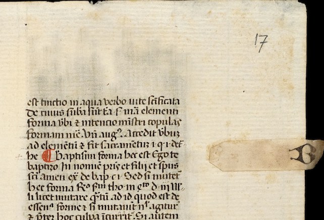
Glued-on parchment strip with letter B, Summa de casibus conscientiae / Bartholomeus of San Concordio. c. 1460-1480, Utrecht, University Library, MS 146, fol. 17r)
A slightly less invasive version, no doubt preferred by medieval librarians, didn’t involve cutting but glueing a tiny strip of parchment on the long side of the page. These so-called “fore-edge” bookmarks could even be filled with extra information, for example what section started at the marked location (“B” for “Baptism” in the image above).
Dynamic Bookmarks
Broeder Geraert, Vitae of St. Christina the Astonishing and St. Lutgard, 13th century, Amsterdam, University Library, MSS I G 56-57
Far more interesting from a book-historical point of view are the more dynamic bookmarks, which could be used at any page of the manuscript because they were movable.
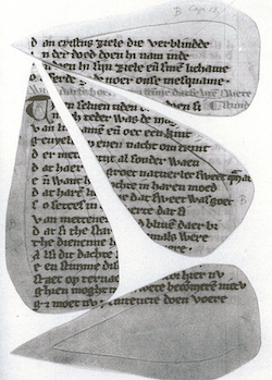
An unusual example is seen here (left)—heart-shaped bookmarks that could be clipped onto a page. Interestingly, they were cut out of a thirteenth-century manuscript with a Middle Dutch saint’s life. The culprits were nuns in the 20th century, who clearly did not appreciate old books. Only a small number of pages of this very important manuscript have survived undamaged. When you study the book in the University Library of Amsterdam, as I did a few years back, a curious collection of full leaves and heart-shaped fragments ends up on your desk.
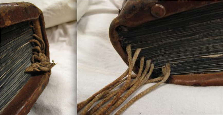
The downside of such clip-on bookmarks is that time tended not to be very kind to them. Since they could be separated from the page, many actually were: they fell out or were never re-inserted by the reader. The solution to the vanishing bookmark came in the form of what is called a “register bookmark.” This type, which looks like a spider with its legs trapped, was securely fastened to the top of the binding (visible below), so it couldn’t get lost. Additionally, the bookmark allowed the reader to mark multiple locations in the book.
Auckland Libraries, Sir George Grey Special Collections, Med. MS S.1588
Evidently, these two groups of bookmarks—static and dynamic—provided very different approaches to marking information—and thus to a book’s use. Readers who added clip-on or “spider” bookmarks anticipated they would need to retrieve information not from one single page but from a changing number of pages. In other words, movable bookmarks served an audience with a shifting knowledge “appetite,” while the static ones encouraged a more “ritual” use of a book. In other words, both types are telling, in their own way, about medieval reading culture.
Multi-Dynamic Bookmarks
Gilbert, de La Porrée, Commentary on the Pauline Epistles, c. 1160-1200, Harvard, Houghton Library, MS 277, fol. 115v
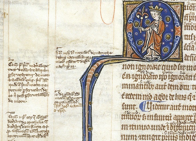
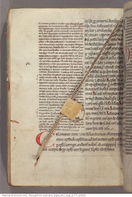
And then there is, finally, the multi-dynamic bookmark – and the story of how a new specimen of this type was discovered. The qualifier “multi-dynamic”, which is my own, refers to the fact that this bookmark is of the moving type, while at the same time it is able to do much more than simply marking a page. The bookmark’s use is as simple as it is clever. This becomes clear when we look at the bookmark in action, for example in this twelfth-century Bible in the Houghton Library.
As you can see, the bookmark consists of two components. As with the spider bookmark, it features a string attached to the top of the binding (in this case the string is a strip from a recycled manuscript page). This allowed the reader to mark a certain page. Nothing new here. The second component, however, is what makes this a smart bookmark: a disk with the numbers 1-4 written on it, fitted in a tiny sleeve. The reader would pull down the marker along the string until the flat top hit the line where he had stopped reading. The disk could subsequently be turned to the appropriate column—an open medieval book usually showed four columns of text—meaning the device marked page, column and line.
Discovery

A medieval revolving bookmark (sold at Sotheby’s, July 5, 2005, lot 16)
Although such rotating bookmarks were used well into the age of print (see an example here), only about thirty-five have survived according to an inventory published in the Transactions of the Cambridge Bibliographical Society (2001). It figures that when in 2005 a tiny specimen of 41 × 22 mm (the size of two thumbnails) was sold off at Sotheby’s, it went for a stunning $11,000.
Just to illustrate that new specimen still emerge, I recently discovered one in the University Library in Leiden, where it was filed in an early-twentieth-century filing cabinet of the Bibliotheca Manuscript Neerlandica—since moved to a fragment collection with shelfmark BPL 3327).

Revloving bookmark fragment, Leiden, University Library, BPL MS 3327 (14th century?), photo: Erik Kwakkel
The Leiden artifact (above) shows all the characteristics of a rotating bookmark: a small parchment disk with four numbers and a tiny hole in the middle. Interestingly, it is only the second specimen identified in Dutch collections, although the one in Leiden is clearly the oldest of the two. While it is hard to date the red roman numbers with precision, it appears they were put on the parchment in the fourteenth century. The striking difference with the Houghton Library specimen above is that the new find comes without its sleeve, which does not survive. It is astonishing still that the tiny disk made it to our day and age. It must have been hidden in the darkness of a manuscript for several hundreds of years until it got separated and became an orphan— sleeveless and without a home.
Finding Books
Books love to hide from us. While you were sure you put your current read on the kitchen table, it turns up next to your comfortable chair in the living room. As you handle more books at the same time, it becomes increasingly challenging to keep track of their location. In the Middle Ages it was even more difficult to locate a specific book. Unlike today, medieval books lacked a standard size, so you couldn’t really make neat piles—which brings a bit of order to chaos. Finding a book was also made difficult by the fact that the spine title had not yet been invented.
So how did medieval readers locate books, especially when they owned a lot of them? The answer lies in a neat trick that resembles our modern GPS : a book was tagged with a unique identifier (a shelfmark) that was entered into a searchable database (a library catalogue), which could subsequently be consulted with a handheld device (a portable version of the catalogue). Here is how to plot the route to a specific book in the medieval library.
Shelfmark

Medieval shelfmark. London, British Library, Royal MS 10 A.xi
The most effective tool for retrieving a book in medieval times was to give it a number and placing it in the correct sequential order on the shelf. It is still common practice in modern libraries, for good reason: as long as the shelver puts the object back in the right spot, you will be able to find it again quickly. Such book numbers—shelfmarks—come in various forms. The more books a library owned, the more complex the shelfmarks had to become. The most simple type merely stated that the book in question was the “twelfth volume” in the cupboard (image above).
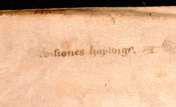
Ghent, University Library, MS 941 (14th century), flyleaf with title and faint shelfmark “A” (15th century),
Similarly, in small collections books were marked with single letters. In Bethlehem Priory near Brussels each item in the small library of Middle Dutch (i.e. non-Latin) books was given a letter, which was placed on an empty page in front of the manuscript together with a short title. The first volume in this mini library was a late-fourteenth-century copy of works by the mystic Hadewijch (above), and on the flyleaf we can still faintly read “Visiones haywigis. A,” showing it was the first book on the shelf.
Chained library “De Librije” in Zutphen, The Netherlands, photo: Erik Kwakkel
Larger libraries–exceeding 26 books–needed a more sophisticated shelfmark system. A particularly clever one is found in manuscripts that were placed on lecterns, like those used in chained libraries. The shelfmarks had two components: a letter that pointed to the appropriate lectern, and a number that indicated the book’s position on the shelf. Because manuscripts were placed on both sides of the lectern, color was added to distinguish between the sides: red numbers referred to books placed on the right side, black ones to those on the left.
The shelfmark tag on the front cover of Lucan’s Pharsalia (below) (“Q 2″) is a variation on this theme. Here the letter was made red so as to indicate on what side of the lectern the book was to be placed. It shows that the fifteenth-century owner of the book, the Benedictine Abbey of Egmond, near Amsterdam, owned a lectern library. Much like a modern GPS, the tag “(red) Q 2″ ties the manuscript to a unique location: it is the third book on the right side of the sixteenth lectern.
Leiden, University Library, BUR MS Q 1, c. 1100, binding 15th century, photo: Erik Kwakkel
Catalogues
Having a location tag is only useful, of course, if there is a searchable database from which the book’s location may be retrieved. How would you otherwise get to Lucan’s Pharsalia in the library, or even know it is present there? The library catalogue is such a database. Up to 1200 the contents list of a monastic library was usually merely an inventory: it marked the presence of a book, but not its location. The later Middle Ages saw a surge of real catalogues, listing books and their location. Some of these catalogues were written out in books (as we will see in a moment), while others were pasted to the wall in the library.
Leiden, Regionaal Archief, Kloosters 885 Inv. Nr. 208A (wall catalogue, 15th century), photo (CC BY-NC-ND 2.0)
A particularly big wall catalogue survives from Lopsen Abbey near Leiden: it originally measured 800×590 mm (above). The books in this list are numbered sequentially (1, 2, 3, etc.) within categories such as “books read during the meals” (libri refectoriales” ) and “books for personal, spiritual development (libri devoti et utiles). However, there is no clear indication as to where the object may be found (the same in this wall catalogue). Readers had to wander through the library to find the right section and then start counting to find the book they were looking for. Not very efficient.
By contrast, other late-medieval catalogues are very clear about the location of a book. Catalogues survive from several monastic libraries in the Forest of Soignes (just outside of Brussels) that actually refer to the sophisticated type of shelfmark seen in the Leiden University Library example above. The ones from Zevenborren Priory (now Brussels, Koninklijke Bibliotheek, MSS II 1038 and 7602, both early 16th century) refer to books on both the “black side” and the “red side” of the lectern.
Handheld Device
The catalogue of the lectern library in another abbey in the forest, nearby Rooklooster Priory, is the cleverest of the lot. It comes in the form of a book with a peculiar shape (now Brussels, Koninklijke Bibliotheek, MS II 152). It is long and narrow—a format that indicates it was made for handheld use, as research has shown. Curiously, the shape of the pages resembles the long inventory slips on the side of book cupboards in chained libraries (see the wooden frames clearly visible in the image below). The hand-held Rooklooster catalogue must have been copied directly from such slips on the side of the lecterns.

Bookcases in Hereford Chained Library
What a clever tool the user ended up with. The open catalogue in his hand presented two columns, one for books on the “black” (left-hand side) side of the lectern, another for books on the “red” (right-hand) side. Moreover, each column is divided into two halves. The top half lists books placed on the upper shelf of the lectern, the lower half those on the lower shelf (these shelves were placed under the lectern, as seen in the image below).

Cesena, Bibliotheca Malastestiana: lectern with shelf,
Standing in front of a lectern with his handheld device, the reader knew precisely which of the volumes in front of him was the one he was looking for: he could identify it without even opening it. This particular medieval catalogue is not unlike a modern navigation system, with “GPS coordinates” directing readers to such works as Ambrose on the Psalms (Black A 1) and Augustine’s Civitate Dei (Red A 5). The only difference is that it never ran out of batteries.
The Medieval Origins of the Modern Footnote
As in our modern day, the urge to write down a note in medieval times often came while reading a book. And so the margins of the page grew into a prime location where the reader could vent his objections or—albeit more rarely—express his or her approval.
This essay deals with the logistics behind this “window dressing”: it shows how a reader with many important things to say kept track of his marginal comments. Particularly, it deals with a serious problem that came with adding notes to the page: how to connect a particular comment, placed among a dozen others, to the specific text passage it refers to. The clever system that was created for this purpose lives on as our modern footnote.
Disconnected

Bern, Burgerbibliothek, MS 234, fol. 11r (9th century),
The crux of our footnote system is the presence of a symbol that connects the note to the relevant location in the text. Curiously, in medieval times it was quite common not to have such connections in place, perhaps especially in the earlier period (see above). When few remarks were added to the page, a reader could deduce with relative ease to which passage a marginal note referred.
Alençon, Bibliothèque municipale, MS 12, fol. 21v (10th century)
It helped if a text was in popular use or known by heart, as many medieval works were. In such cases the note made sense instantly because the reader was familiar with the referenced literary context. Moreover, as long as notes were few and short, a reader could simply insert them—interlinearly—above the relevant word or passage (see above).
Cologny, Fondation Martin Bodmer, Cod. 89, fol. 59v (Horace, 12th century)
Cleverly, in this system the very position of the remark identified the word to which it referred. However, as the number and size of such comments increased, it became impossible to place them between the lines. The great blank space provided by the margins was now drafted into service. It is here that the absence of a proper reference system was felt. As the marginal body of remarks and critique began to accumulate, the page became a messy place, a labyrinth in which it became impossible for readers to find specific pieces of information (see above). In came the footnote.
Dots and Lines
Connecting a marginal remark to the relevant passage in the text was usually done with a duplicated symbol, called a signe de renvoi: one was placed in front of the marginal note, the other near the word or passage that the remark commented upon. While it is hard to deduce a clear pattern of development, it appears that in the early stages of using such footnotes scribes and readers resorted to plain symbols rather than letters or numbers. These symbols varied considerably in shape and sophistication. At the high end of the spectrum we encounter complex symbols, such as the reversed letter E seen in the image below (magnified).
St Gall, Stiftsbibliothek, MS 4, p. 170 (820-840)
More popular, however, were less complex symbols, which could be added to the page much quicker. Dots and lines are particularly common ingredients of such footnote symbols. Interestingly, their first appearance is not as a connector of comment and text, but as an insertion mark that added an omitted line into the text. In the image below such an omitted line is placed in the margin accompanied by a symbol made up of a line and a dot. It is repeated in the text itself, near the location where the line belonged. This omission mark may well be the origins of the footnote system that would emerge over the course of the Middle Ages—and that we still use today, almost unchanged.
[LEFT]: Einsiedeln, Stiftsbibliothek, MS 172, p. 20 (9th century)
[RIGHT]: Leiden, University Library, VLF MS 69, flyleaf (12th century), photo Erik Kwakkel
Scribes used different versions of the line-and-dot symbol. In fact, they had to if they were to produce unique ties between comment and text. When dots were used, their number would increase as more notes were added. Alternatively, the position of the dots could be varied, so that they formed different—unique!—patterns.
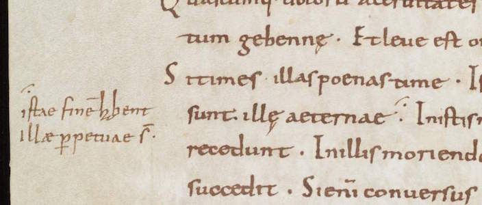
Customising the line-type footnote, scribes usually distinguished one from the other by added circles, which were attached at different locations and in varying numbers. In what is a most unusual find, in a Leiden manuscript we see a scribe practicing his dot and line footnote symbols (left). It shows variations in the number and pattern of dots, as well as in the treatments of lines.
Letters
Closest to our modern system of footnotes, finally, is the use of letters to tie a marginal remark to its proper location in the text. In some manuscripts we see the entire alphabet running down the margin. The image to the left shows a page from a manuscript with works by Horace (left column) to which a high volume of notes were added (right column), all of which are connected to specific passages with the letters A to Z.
Leeuwarden, Tresoar, 45HS, fol. 45r (c. 1100), photo: Erik Kwakkel
In the eleventh and twelfth centuries such classical texts were most commonly used in a classroom setting. The instructors who used the books, typically in a monastic school, had many things to explain to their students, as the notes show. It made sense to organise such added information in a clear manner, and the alphabet came in handy in this respect. Some pages in this particular book contain more footnotes than there are letters in the alphabet, which challenged the system. In such cases the user added into the mix symbols made from lines and dots.
The Last Word: Numerals
So where are the medieval footnotes that make use of numbers, like we do today? Curiously, I have not been able to find them, which makes sense. Roman numerals would not be suitable for the task. Placed out of context, as a symbol initiating a segment of text (i.e. the marginal comment) they would easily be mistaken for a letter—which they are, graphically speaking. Moreover, a high Roman numeral would quickly take in a lot of space —not what you want in a note symbol. Arabic numerals were far less popular than Roman numerals, even in the later Middle Ages. Readers may not have felt comfortable enough with these new numbers to use them in the margin. In fact, some scribes in the later Middle Ages are still confused by the zero. The leap from alphabet to numerals—from the medieval to our modern system— appears to have been taken in the age of print.
Medieval Notepads
We are surrounded by pieces of scrap paper. We chuck tons of them in the waste bin each year, leave them lying on our desks, use them as bookmarks, stuff them in our pockets, and toss them on the street. And so we usually do not have to look hard or long when we need a piece of paper for our shopping list or for writing down a thought. This was very different in medieval times. Writing material—of any kind—was very expensive back then, which meant that scribes used a paper or parchment sheet to the max: everything was used. As a result, there was nothing obvious lying around on one’s desk that was suitable for scrap material. So how did the medieval person make notes?
In the Margin
The most common and sensible location for putting down thoughts, critique or notes was the margin of the medieval book. Consider this: you wouldn’t think so looking at a medieval page, but on average only half of it was filled with the actual text. A shocking fifty to sixty percent was designed to be margin. As inefficient as this may seem, the space came in handy for the reader. As the Middle Ages progressed it became more and more common to resort to the margin for note-taking. Notably, the thirteenth century gave birth to two particularly smart book designs that accommodated such use. Both types are connected to the emerging university, which makes sense as this was a note-taking environment par excellence—then and now.
Leiden, University Library, BPL MS 2888 (Italy, 13th century), Photo Julie Somers, Turning Over a New Leaf (CC BY-NC-ND 2.0)
The first of these is seen in the image above, which shows a page of a law manuscript that actually contains two kinds of texts. Found in the two central columns is the Digest of Justianian, written in a slightly larger letter. Draped around it, in a smaller letter, is the commentary to this work: these are the notes of smart teachers from the past, put there collectively to help the reader make sense of the law. This specific style of presenting two works on the one page, where the glosses (commentary) are presented as “square brackets”, is called textus inclusus. An Italian reader in the thirteenth century added his own two-cents to these “prefab” opinions that came with the book: in the image above we see them scribbled between the two central columns.
London, British Library, Harley MS 3487 (13th century), British Library, London
The second thirteenth-century book layout that was specially designed to accommodate note-taking is as clever as the text on its pages. We encounter it first and foremost in manuscripts with works by Aristotle, although the design would spread to other domains, including law and medicine. As seen in the image above, the margins surrounding the Aristotle text (which form the two central columns) were left completely blank by the scribe. The tiny writing that is seen there now is from a student in the Arts Faculty, where the works of Aristotle formed the main textbook, called the Corpus vetustius (the old corpus).

Detail, London, British Library, Harley MS 3487 (13th century), British Library, London
If you look carefully at the detail above you see five vertical commentary columns marked by thin pencil lines, which allowed for five “pillars” of notes. Cleverly, in this page design the start of the note could be placed at the same height as the Aristotle line on which it commented, not just one time, but five times over! Larger comments were placed in the larger blank areas in the lower margin. Some of these Aristotle textbooks contained up to twenty “zones” for notes, which would ultimately be connected to the main text with the help of symbols resembling our current footnotes.
Yellow Sticky Notes
Paper and parchment sheets were commonly used to the max, meaning no redundant material was left that could be used for scraps. However, when the animal skin was turned into parchment sheets such redundant material was left over. In the process the outer rim of the dried skin was removed, because these “offcuts” were deemed unsuitable for writing on. The material was too thick for a regular page and its surface was slippery and translucent, not to mention that most offcuts were too small for normal pages. They consequently ended up in the recycling bin of the parchment maker.
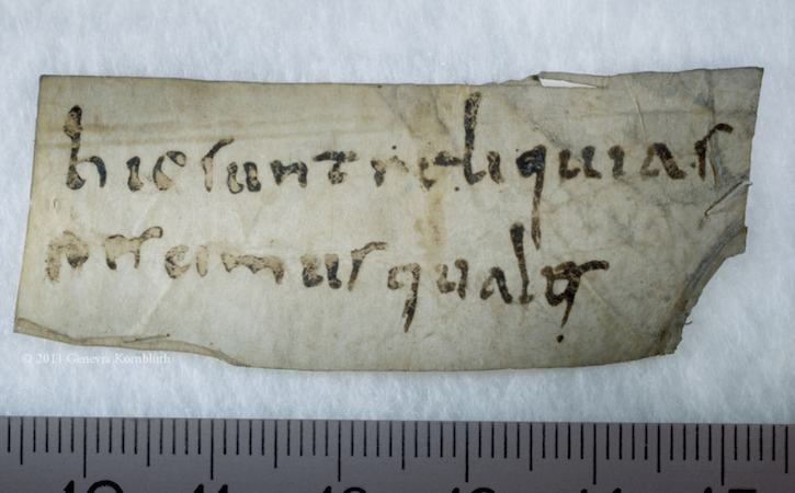
Sens CT Library, J 36 (Chartaire 156), 9th century, photo Genevra Kornbluth
Interestingly, these small, scrappy slips of parchment were sometimes sold to clients. Offcuts were used for text with a short lifespan, such as letters and drafts. In addition, it was used when a text was “utilitarian” and did not need to be produced from regular – more expensive—parchment. An example is seen in the image above, which shows a short description strapped to a bone that belonged to a saint. Such “relic labels” were important because of course nobody wanted to mistake the big toe of St Peter for that of St Paul. Such information was scribbled on the parchment strip, usually in low-quality (fast) handwriting.

Leiden, University Library, BPL MS 191 D, fragment (13th century), photo Giulio Menna
Offcuts were also frequently used by students and scholars, for example for taking notes in the classroom (image above). In fact, in De discipline scholarum, a guidebook made in the 1230s for students and teachers at the University of Paris, it is explained how a student should bring such slips of parchment to class for taking notes. Interestingly, some of these slips have survived because they were pasted in a student’s textbook, like the one seen in the image above. These are truly the medieval equivalent of our “yellow sticky notes.” The practice of bringing scrap material into the classroom was a much broader medieval phenomenon, as is shown by the famous birch bark notes that survive from 13th-century Russia. The image below shows funny “stick figure” doodles drawn by the student Onfim as he was sitting—bored no doubt—in class.
Novgorod, Museum of History, birch bark strip 202, from pupil Onfim, dated 1240-1260
The Last Word: Notepad
There is evidence that multiple parchment offcuts were sometimes bound together, by pricking a hole in them and pulling a cord through. These bundles, which essentially form a true notepad in the modern sense of the word, could be of considerable size. A specimen in the University Library, Würzburg consists of thirty slips. A type of notepad that was even more popular in medieval times was the wax tablet. These, too, were often tied together into a bundle, forming a notepad of perhaps six or so “pages” (image below, note the holes for the cords on the left side). Smart pages, that is, because the contents could be erased from the soft wax (with the flat back of the stylus), presenting vacant space for fresh thoughts.
Michigan, University Library, Papyrology Collection, Inv. 768 (4th-6th century), photo: University of Michigan Library (CC BY 3.0)
This particular one, which is a stunning 1500 years old, was likely used in a classroom setting in Christian Egypt, probably by one Ischyrion, whose name is carved into the wood on the other side. Curiously, the object preserves some of its original contents. When you pressed too hard with your sharp stylus, an imprint was left in the wood behind the wax. We therefore know that Ischyrion was studying the Bible, given that the indentations have been identified as Proverbs VII, 3-13.
As with the other examples of note-taking shown in this post, the tablet is a time capsule that presents us with the thoughts of individuals that lived over a thousand years ago. While the notepads from Egypt, France, Italy and Russia present highly personal scribbles not meant for posterity, time turned them into fossilised pieces of public history stuck to pages, slips and tablets.
The Medieval Calendar
Manuscripts for Devotion
Many manuscripts were created for public or private devotion. Manuscripts for the Mass included the sacramentary, the gradual, and the missal, described below, and others. For personal prayer, people from all walks of life commissioned the popular books of hours.
The Sacramentary
A sacramentary, the most important type of liturgical book used in the early medieval Church, contains the prayers recited by the priest at Mass. The book lay open on the church altar—the most sacred site within the building—where the priest celebrated the Mass while worshipers looked on. This Ottonian sacramentary manuscript (see the pages below) includes a full-page Crucifixion, at the right, beautiful illuminated initials, and an abundance of knot work. As seen in the page on the left, the text was largely executed in gold and silver. These luxurious materials, with its reddish-purple painted background that imitates the purple-dyed parchment of antiquity, recall the most splendid books of Imperial Rome.
Left: Ornamented Monogram VD; Right: _The Crucifixion,_about 1000–1025, Ottonian, Fleury, France, tempera, gold, and silver on parchment, 9 1/8 inches high x 7 1/16 inches wide (The J. Paul Getty Museum, MS. LUDWIG V 1, FOL. 1V, 2V)

Initial R: The Resurrection, late 1400s or early 1500s, Antonio da Monza, Italian, Rome, tempera and gold leaf on parchment, 25 1/4 inches high x 17 1/8 inches wide (The J. Paul Getty Museum, MS. LUDWIG VI 3, FOL. 16)
The Gradual
Graduals included the sung parts of the Mass. The gradual at the left is over two-feet tall and is one of the largest volumes in the Getty’s manuscript collection. The large size was deliberate: It enabled a group of singers standing before it to read the notes and words.
This gradual was especially evocative of the High Renaissance. Like other works of art from the late 15th or early 16th century, it is decorated with representations of antique gems and cameos, putti, garlands, and Grotesques (fantastic mixed-up creatures).
The Missal
The missal is a service book that contains chants, prayers, and readings, together with ceremonial directions. The missal seen here was commissioned by Cosimo de’ Migliorati,

Christ in Majesty; Initial A: A Man Lifting His Soul to God, 1389–1404, Master of the Brussels Initials, Italian, Bologna, tempera, gold leaf, and gold paint on parchment, 13 inches high x 9 7/16 inches wide (The J. Paul Getty Museum, MS. 34, FOL. 7)
Bishop of Bologna and a cardinal, around the time in which he was elevated to the papacy as Innocent VII. The sumptuous miniatures in this book depict religious scenes, but the decorative borders are more secular in nature. They contain drolleries (amusing or grotesque figures), along with heraldic details. The pages originally included the arms of Cosimo de’ Migliorati, but these were overpainted with the arms of a later owner of the manuscript, the Antipope John XXIII (who was an elected pope in opposition to a pope canonically chosen).
The Book of Hours
One of the most popular books from the 14th—16th centuries was the book of hours. Books of hours contain devotional texts designed to aid private prayer, and they were often lavishly illuminated. Because no other book was created in greater quantity in the late Middle Ages, the book of hours has come to be called the medieval bestseller. One might say that the book of hours is a church calendar and day planner of prayer, for it helps to organize time throughout the year and to structure daily devotion. The central text is the Hours of the Virgin, which includes Psalm verses, hymns, prayers, and readings to be recited during the eight canonical hours of the day. In addition, these manuscripts include a calendar of the major feast days and the tools used to calculate the date of Easter, the most important feast day of the Christian calendar.
Initial D: The Visitation; Initial D: The Lord Enthroned (left), detail (right), about 1300, French, northeastern France, tempera and gold leaf on parchment, 10 3/8 inches high x 7 3/16 inches wide (The J. Paul Getty Museum, MS. LUDWIG IX 3, FOL. 63V)
The Ruskin Hours is a relatively early example of a book of hours (see above). The profusely decorated manuscript includes almost 100 historiated initials (letters containing identifiable narrative scenes or figures),miniatures that illustrate the calendar, and an illustrated litany. Further illuminations called marginalia appear on many of the pages. Secular vignettes of humorous animals and figures are meant to provide a playful counterpart to the religious narratives. In the detail (above right), two men perched on the marginal extenders of the border decoration seem to be engaged in a game of “chicken” with monkeys on their backs. Although their game has nothing to do with the sacred subject matter of the Visitation, their positions are a playful adaptation of the women’s greeting above.
Compare an additional page from the Ruskin Hours, c. 1300, with the Spinola Book of Hours, dated approximately 210 years later. Both scenes shown below share the story of the Annunciation. The earlier page at the left is largely filled with script, the opening phrases from Psalm 50. Accompanying these words are winding, spiraling, and elongated vines. The figures are relatively flattened, and in the case of the Virgin Mary and Gabriel, placed against a diapered ground (a traditional, flat patterned background).
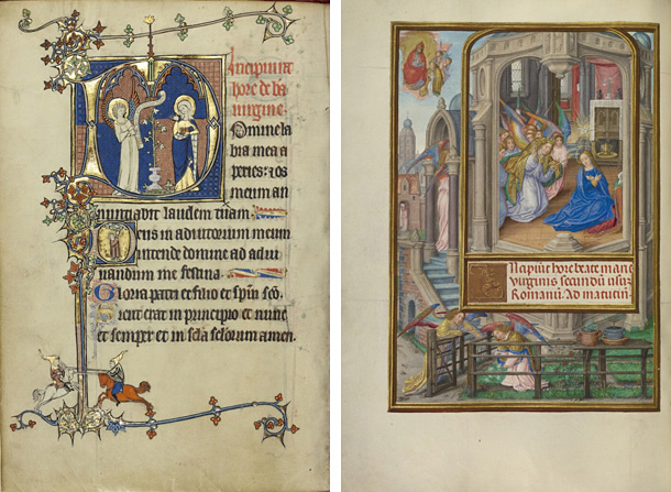
Left: Initial D: The Annunciation; Initial D: A Young Man Praying to Christ in the Clouds, about 1300, unknown, French, northeastern France, tempera and gold leaf on parchment, 10 3/8 inches high x 7 3/16 inches wide (The J. Paul Getty Museum, MS. LUDWIG IX 3, FOL. 37V). Right: The Annunciation, 1510–1520, Master of James IV of Scotland, illuminator, Flemish, Bruges and Ghent, tempera colors, gold, and ink on parchment, 9 1/8 inches high x 6 9/16 inches wide (The J. Paul Getty Museum, MS. LUDWIG IX 18, FOL. 92V)
In contrast, the story in the later Spinola book (see the page above right) is depicted more visually, accompanied only by a short sentence. The background is as detailed as the figures themselves. The artist has paid special attention to perspective and the sense of space within the picture frame, showing both the exterior of the building along with a cutaway into the structure so the viewer can be witness to the sacred scene. These differences mirror changes in Renaissance panel and canvas painting, with new interest in three-dimensional modeling, architectural rendering, and detailed landscapes.